Attention: Please take a moment to consider our terms and conditions before posting.
Castore kits thread (24/24\5 3rd kit page 83/84)
Comments
-
Fuming.6
-
Garrymanilow said:It is still incredible to me that despite the big comeback of 90s fashion no-one has taken a proper crack at either of the 95-96 green, purple and white shirts. We’ve had two black kits with little bits of purple and green on them but the stage is set for an update on those shirts. Those are the retro kits you most commonly see at games and instead we get some fairly uninspired black or white kits every year. It’s a third kit we don’t even need, get weird with it!
Agreed! I had the green, purple and white shirt on in Tenby last week. Various supporters of other clubs stopped me to admire it!0 -
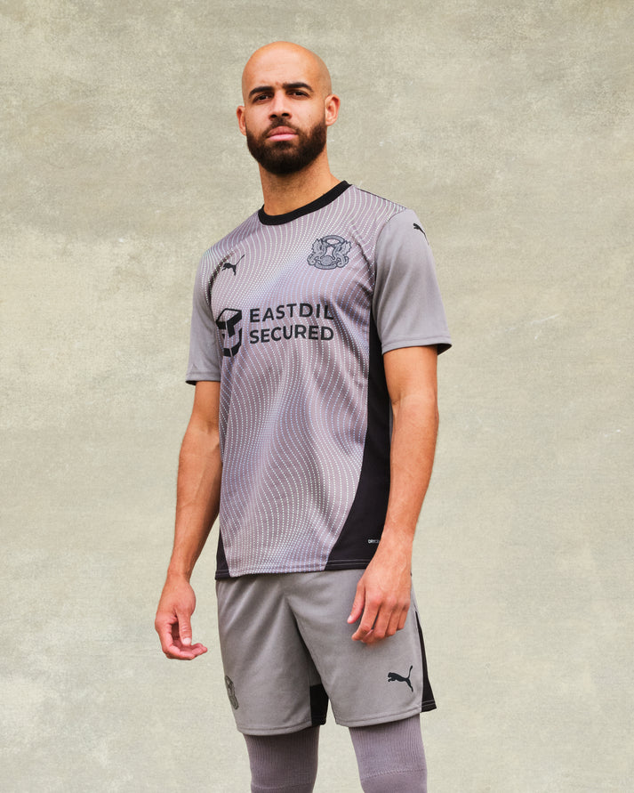
Pretty nice that. Probably Castore’s best effort so far. They really need to get better at making the kit available online as soon as it’s announced though. Can’t even browse it on the online shop yet (I know they said 11am in-store).Need to drop the marketing wank on some of these releases though.0
-
Usually a fan of a central badge, but the sword, Castore, and RSK all too close on the shirt and looks crap imo.
0 -
 It’s like someone looked at Orient’s kit on Saturday and thought “why don’t we flick a bit of oil on it”
it’s ok, I’d like it more as a training top with the logos non-central and without the sponsor5 -
Third kit looks like Orients kit from Saturday.0
-
How hard can it be to line the sword and the Castore logo up?6
-
Having spilled a tragic amount of sauce down myself on Saturday, I would have been grateful for the cover that this shirt provides.1
-
Does anybody think it looks a bit like Orients kit from Saturday?4
-
So the only time we will wear this 3rd kit is when we play Melchester Rovers.3
-
Sponsored links:
-
the big question is - was it really sauce?Addickhead86 said:Having spilled a tragic amount of sauce down myself on Saturday, I would have been grateful for the cover that this shirt provides.1 -
Looks like Chuks had to change a spare wheel on his way to training!!6
-
This is the Orient kit, which to me is horrible. The shirts and shorts don't even match.


0 -
Must say seeing it on Saturday I said that it’s one of the most boring kit I can ever rememberkillerandflash said:This is the Orient kit, which to me is horrible. The shirts and shorts don't even match.
 1
1 -
Pattern looking like the aftermath of a pornhub session.4
-
They've had some odd ones over the years...AFKABartram said:
Must say seeing it on Saturday I said that it’s one of the most boring kit I can ever rememberkillerandflash said:This is the Orient kit, which to me is horrible. The shirts and shorts don't even match.


0 -
Boring kit but then again with a yellow away kit it’ll barely be worn0
-
Trouble is they’ve lined the width of the sword and hand combined so it looks off centre. They should have lined the middle of the sword up to the middle of the Castore logo so it’s visually centred…schoolboy error, like the kit though, might get it next May!moutuakilla said:How hard can it be to line the sword and the Castore logo up?2 -
Looks more like a One Day Cricket shirt. Wonder if this will be the last shirt we get from Castore?1
-
Bit of a let down after the home and away kits, which are both quite nice0
-
Sponsored links:
-
I like it.Decent enough effort from Castore on the designs this year for me, just wish they’d gone one way or the other (ecru or bright yellow) on the shade of the away top - not such a fan of them trying to please both camps.0
-
They are lined up. The tip of the sword is not the centre of the logo.moutuakilla said:How hard can it be to line the sword and the Castore logo up?1 -
On first glance, it’s darker than the Orient kit and I don’t mind it but then again I’m a bit of a grey person.0
-
I don't mind it. I won't buy it, not til it's super cheap anyway.
0 -
7, 7 and 5 for me.Pelling1993 said:Home kit - superb 9/10
Away kit - nice 7.5/10
Third kit - fine 6/100 -
It doesn't look 100% the same as the one they showed us, might be wrong.
For everyone moaning about the badge configuration (rightfully so), this was mentioned several times to Castore ...0 -
According to the club, the grey shirt 'includes telescopic imagery and galactical visuals inspired by Greenwich's Royal Observatory'. Really?!? Who makes this stuff up?14
-
Surely the only positive with Castore is that one of the badges will come off on its first wash and you can then stick it wherever you fancy?cafc999 said:It doesn't look 100% the same as the one they showed us, might be wrong.
For everyone moaning about the badge configuration (rightfully so), this was mentioned several times to Castore ...8 -
The issue with the badge is that it's not symmetrical, so will look wrong however positioned. Intuitively you think the tip of the sword should match the centre of the castore and RSK logos, but then it would have additional weight on the right due to the hand and throw off the layout. You'd hope they had experimented with various positions in the design process and this layout looks the least "wrong", but it's an inherent issue with having a non-symmetrical badge forced into what should be a symmetrical layout.
As for the actual kit, I quite like it, but will always prefer a v-neck (or pretty much any shaped/styled neckline) to a round-neck. I'll probably be getting one around Easter lol2 -
Burton, Cambridge, Mansfield ... at least.Elthamaddick said:Boring kit but then again with a yellow away kit it’ll barely be worn1


