Attention: Please take a moment to consider our terms and conditions before posting.
Next seasons shirts to be made by...
Comments
-
Haven't bought a kit since the last Viglen one. Disliked all the sponsors such as Redbus, Krbs etc which to me ruined the shirt. Hope we get a good sponsor form this one as so far it looks great0
-
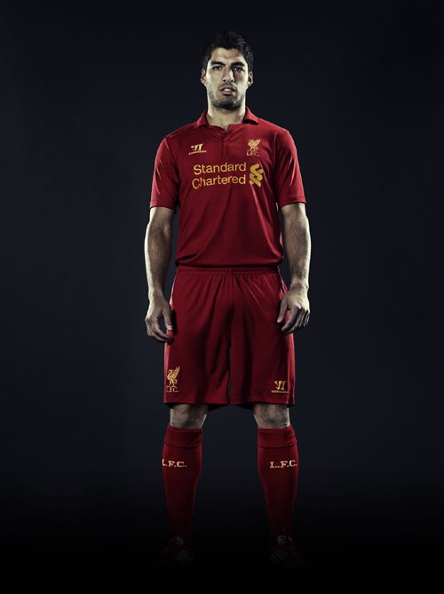
That Liverpool kit looks fantastic if you ask me - a cut above our one.
Just missing a tick.....................0 -

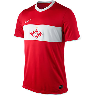
This is the Spartak Moscow 2011/12 kit, could this have been adapted, with the badge moved to the normal position, and the sponsor on the white stripe?0 -
Don't like the big white stripe.................Looks too much like Boro to me.0
-
-
seeing it in that picture with the red devils it does look a hell of a lot better than what it looks like on that manikin in the club shop.
just hope the sponsors logo works with it.0 -
I seriously doubt we sell enough kits for the manufacturer to go to a lot of trouble for us. Even if Nike was chosen months ago it is likely that we would have had a deadline that was several months before the kit was to be released for sale. There is a rumour site for football its somewhere, and they have mock ups of the new kits on there months before they are made public.
With that in mind we might have had to start discussions back in September to have a choice of anything at all. The closer we get to the date that we expect to take delivery of, literally, thousands of shirts the less choice we would have.
Very few of the clubs in the Championship (never mind League One) are given a special unique design of kit - especially from Nike. We were probably always going to have to choose one from their catalogue and they were clearly going to point us in the direction of the one that they preferred to sell us - based on stock levels, manufacturing schedules etc.
I hope that the shirt will be available soon, but I would have thought sticking out for something a little more specific (even if it were an option) would have delayed that delivery and cost the club a lot in cash flow if not in income.0 -
Bit of an issue for shirt sponsorship if the Away one is black - more difficult to get signed!! Need to remember this when we come to choose our CL sponsored players - would be better to get Home kits.
I have the previous black kit framed at home with signatures in silver pen and it looks all the better for it.
0 -
0
-
New Liverpool shirt:
 0
0 -
Sponsored links:
-
Why can't Charlton get a big brand like Warrior?
0 -
Why can't Charlton get a big brand like Warrior?
Yeah, Liverpool's is only a poky £25million a year deal.
0 -
Edit - repeated a previous comment. Too damn slow.0
-
I don't like the new kit it's boring and plain I don't care that Nike make it, agree with tango my boy has macron home kit and tracksuit both look fantastic I think.0
-
It may look better with the sponsor, keep the faith.0
-
That Liverpool kit to be looks a bit dull, in my mind Liverpool need the adidas stripes on their shirt, anything else doesn't seem right!0
-
I like the new kit, I like that it's plain and has a collar, whether it's used for ties or cravats. I do wish it had a couple of tweaks (white on it somewhere, maybe collar). In spite of myself, I like that it's a major brand for a change. Our last KRBS with the white stripe, which this one looks like, was a nice shirt too (I'm one of the few who detests our current shirt!).0
-
Not keen on collars on football shirts, but I like simplicity. Overall, I like it. With a nice white simple sponsor's logo, it'll look fine. Classy, hopefully.
The cut is a bit baggy and shapeless though.0 -
I really like it, I like its Nike, like it's plain and like that it has a collar, all in all I like it, like!0
-
Sponsored links:
-
I like collars on football shirts so it's a yes from me..... if only we'd update the badge as Liverpool have done.0
-
Only concern is the cut. i hope its nice and fitted0
-
All we saw was a shirt on a manican that obviosly wasn't there to fit the manican so it will be fine once we look at it on the players0
-
any more pics of the new kit yet....when will the new sponsor be named?0
-
All we saw was a shirt on a manican that obviosly wasn't there to fit the manican so it will be fine once we look at it on the players
On a man in a can?0 -
The new kit looks much nicer than I expected.0
-
Haynes wearing the new shirt....

edit: this shirt was last seen being modelled by haynes on page 19.
0 -
Positivity please.0
-
....Christmas !
(Still makes me laugh.......)0 -
All we saw was a shirt on a manican that obviosly wasn't there to fit the manican so it will be fine once we look at it on the players
what about the red devils at the top of the page ?
0


