Attention: Please take a moment to consider our terms and conditions before posting.
Next seasons shirts to be made by...
Comments
-
If this is the case, then why show the one in reception?It's the wrong colour, would prefer Macrom to this.
The club know this, it will be 'Charlton red' by the time it makes the store.
I don't like the dark red, it looks like the Arsenal kit from the other year when they changed back to the colour worn by them, when they played this side of the river.
Now it could be that this was the colour that the young lads of Charlton first had in 1905, as they got their tops from a shop in Woolwich.0 -
I think it looks good- less cam be more.0
-
Let's face it no matter what the kit looked like some will like it some won't.
I think it's ok but would like to see it when is complete with the Vodafone logo.0 -
Let's face it no matter what the kit looked like some will like it some won't.
I think it's ok but would like to see it when is complete with theVodafone02 logo.0 -
Underwhelmed. Wrong red as well.
Money raised by the Charlton Life shirt sponsorships seems like it will be well down next season.
If the away kit is like that but black I'll get that instead.
0 -
Preferred NUGs design tbh but ive seen worse and we've had worse. Would have liked to see a bit of white piping on the sleeves. The red is just plain wrong.0
-
we have to have a sponsor if fifa/uefa made barcalona. im sure they'll make us.
For years Barcelona refused to have a sponsor then chose Unicef to break the policy - then signed up the Qatar Foundation at £25m a year, the reason they did it is because they are several hundred million € in debt, not because UEFA made them.
0 -
I like the new design, less is more and breaks the trend of over-the-top designs.0
-
-
Unlikely. You don't sponsor the shirts because you like the way they look.Underwhelmed. Wrong red as well.
Money raised by the Charlton Life shirt sponsorships seems like it will be well down next season.
If the away kit is like that but black I'll get that instead.0 -
Sponsored links:
-
Club badges should not be messed with. Ask Millwall or read the Palace badge thread.0
-
Club badges should not be messed with. Ask Millwall or read the Palace badge thread.
so how did we get to our current badge then?
It's not hardly messing with it, is it? 0
0 -
Very true and a robin before that. Now we have our longest serving badge we shouldn't mess with it.Club badges should not be messed with. Ask Millwall or read the Palace badge thread.
so how did we get to our current badge then?
It's not hardly messing with it, is it?
0 -
but with your view, we would still have the robin, would we not..?
Just thought that the kit looked very 'retro' , so a 'retro' badge would be nice.
You are correct about people moaning and you can never please all of the people all of the time.
I'm sure when we changed from the robin to the sword and the sword to the current badge, there were many that complained.
This was just my opinion, that is all.
Sorry for any offence caused by daring to be different.
0 -
but with your view, we would still have the robin, would we not..?
Oh for goodness sake no need for that last comment. Its my opinion that we should retain our current badge. Its our trademark now not the robin or the sword in isolation. For what it's worth I would be happy if we had retained the robin. Again for what it's worth I like the design you propose. Very striking but for me it's not Charlton.
Just thought that the kit looked very 'retro' , so a 'retro' badge would be nice.
You are correct about people moaning and you can never please all of the people all of the time.
I'm sure when we changed from the robin to the sword and the sword to the current badge, there were many that complained.
This was just my opinion, that is all.
Sorry for any offence caused by daring to be different.
0 -
like that badge on cafc999's kit0
-
Shooters,
Didn't mean it to sound rude.
0 -
I personally prefer the existing badge, but as we will not be consulted on the final decision it is a bit academic.0
-
Shooters,
And I apologise too. Today is a day for celebrating. If we do get your preferred badge I will hold you responsible ;0)
Didn't mean it to sound rude.
0 -
") 0
0 -
Sponsored links:
-
I'm not sure about the cut. Looks baggy on the body and the arms.0
-
I'm not sure about the cut. Looks baggy on the body and the arms.
Er get the correct size ....0 -
I doubt it will look that baggy on me or on a good few other lifers ;0)0
-
Think I'll stick to wearing my Macron one until we get one I like. No need to buy one of these as I can just sew a charlton badge on a polo shirt...................0
-
I liked it a lot. Simple is beautiful.
agreed, classy, old school.0 -
I'm not sure about the cut. Looks baggy on the body and the arms.
Probably bigger versions as they had to fit over the para's flight suits - looked fine on the slimmer of them up in the stand.0 -
http://www.jjbsports.com/pws/client/images/catalogue/products/38251151/large/38251151_red.jpg
ohh great we can already buy it !0 -
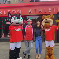
Looking at that old picture of Keithy Peacock, the new shirt would definitely look better with a white collar0
-
Gutting I was hoping that was our new kit.
https://us.v-cdn.net/5000498/uploads/FileUpload/a0/e711ce2c140139a2a37283a08fda92.jpg
0


