Attention: Please take a moment to consider our terms and conditions before posting.
Big Screen /scoreboard
chilham
Posts: 308
I was expecting to find a thread about the change of Big Screen/scoreboard design - perhaps I am alone in thinking that the new design is 'challenging' to read from a distance with the changes in colour, size and layout? I was struggling to read the players' names and the time from the Upper West on Saturday,though I gather from other sources that the present design is temporary?
10
Comments
-
Agree it’s not the best at the moment but I suspect it’s been designed with the new larger screen in mind?
As an aside the uneven padding around the team names really gets to me. Just like the uneven spacing on the new JS stand lettering 1
1 -
I didn't like the design either. Really hard to see yellow cards against a white background.2
-
Scoreboard hasn’t changed yet- think that’s coming in a few weeks/months!Agree the updated design (of text/graphics) looks a bit small, but presumably it’s a temporary fix until the next screen is implemented.
really pleased the club have tried to reduce the ‘noise’ and colours used - based on CAST Feedback- and made it more colourblind/sight impairment friendly, albeit still slightly too small text3 -
where can i see the updated design?sammy391 said:Scoreboard hasn’t changed yet- think that’s coming in a few weeks/months!Agree the updated design looks a bit small, but presumably it’s a temporary fix until the next screen is implemented.
really pleased the club have tried to reduce the ‘noise’ and colours used - based on CAST Feedback- and made it more colourblind/sight impairment friendly, albeit still slightly too small text0 -
I’m pretty sure it’s not out, we just got told it’s gonna fill in that whole gap between the two stands.2
-
sorry, i meant the design of the text/images/graphics used on the screenIR94 said:
where can i see the updated design?sammy391 said:Scoreboard hasn’t changed yet- think that’s coming in a few weeks/months!Agree the updated design looks a bit small, but presumably it’s a temporary fix until the next screen is implemented.
really pleased the club have tried to reduce the ‘noise’ and colours used - based on CAST Feedback- and made it more colourblind/sight impairment friendly, albeit still slightly too small text1 -
That’s going to look great. Was very impressed with the enhancements to the stadium we saw on Saturday.ValleyGary said:I’m pretty sure it’s not out, we just got told it’s gonna fill in that whole gap between the two stands.3 -
If It's as big as they say It's gonna be, perhaps they could park it in front of the Jimmy Seed stand, for testing purposes first. I would suggest the 13/9 could be a very suitable date. Coincidently I believe thats also the day of the Millwall game- so leave it in the box, and maybe paint a picture of a floodlight pylon on the back facing the boys from the Den.6
-
Belowsammy391 said:
sorry, i meant the design of the text/images/graphics used on the screenIR94 said:
where can i see the updated design?sammy391 said:Scoreboard hasn’t changed yet- think that’s coming in a few weeks/months!Agree the updated design looks a bit small, but presumably it’s a temporary fix until the next screen is implemented.
really pleased the club have tried to reduce the ‘noise’ and colours used - based on CAST Feedback- and made it more colourblind/sight impairment friendly, albeit still slightly too small text
I don't mind it other that the clock is a bit small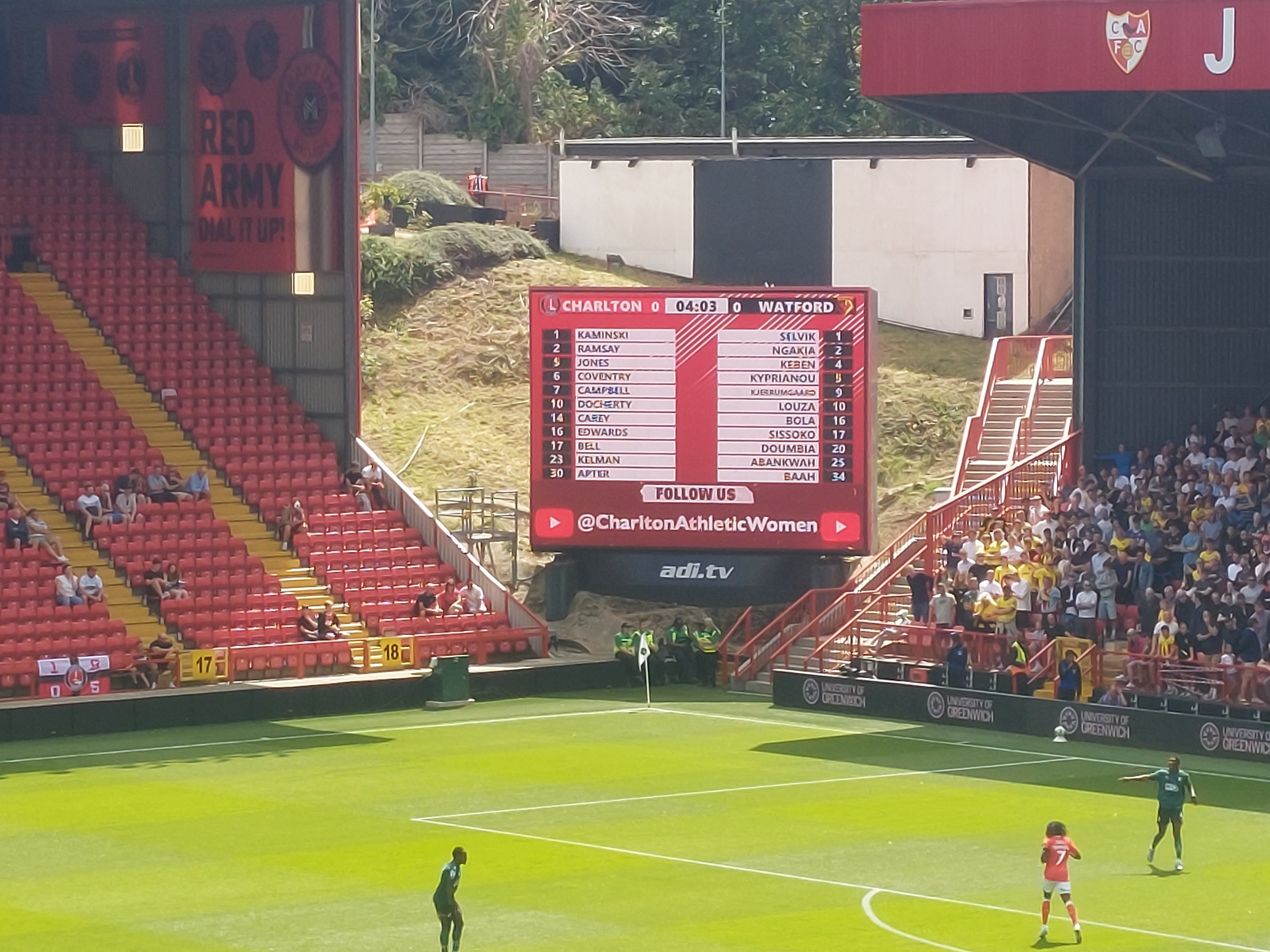
0 -
Currently on a boat from ChinaValleyGary said:I’m pretty sure it’s not out, we just got told it’s gonna fill in that whole gap between the two stands.1 -
Sponsored links:
-
Its not the one that Gillingham are still waiting for is it?Henry Irving said:
Currently on a boat from ChinaValleyGary said:I’m pretty sure it’s not out, we just got told it’s gonna fill in that whole gap between the two stands.0 -
Yes, the Font size & layout are meant for the big screen that is being installed in Sept/Oct. The new stuff is being designed & installed by the new Company based in Preston. They operate other clubs tech stuff too.chilham said:I was expecting to find a thread about the change of Big Screen/scoreboard design - perhaps I am alone in thinking that the new design is 'challenging' to read from a distance with the changes in colour, size and layout? I was struggling to read the players' names and the time from the Upper West on Saturday,though I gather from other sources that the present design is temporary?
From the clip put out by the club last week the screen is going to completely fill the gap between the AC & JS stands.2 -
Only main issue was the cards and footballs against the white background. I find the overall aesthetic of the black on white easier to read than some previous scoreboards we've had0
-
Will they take out the stairs or will it sit higher up I wonder?0
-
How dare they put that on the bottom 😜😜😜😜😜😘😘😘😘😎😎😎😎😎Henry Irving said:
Belowsammy391 said:
sorry, i meant the design of the text/images/graphics used on the screenIR94 said:
where can i see the updated design?sammy391 said:Scoreboard hasn’t changed yet- think that’s coming in a few weeks/months!Agree the updated design looks a bit small, but presumably it’s a temporary fix until the next screen is implemented.
really pleased the club have tried to reduce the ‘noise’ and colours used - based on CAST Feedback- and made it more colourblind/sight impairment friendly, albeit still slightly too small text
I don't mind it other that the clock is a bit small 6
6 -
Better on top?4
-
Always 😘🫣😎🤣🤣🤣WSS said:Better on top?5 -
My guess is it's going to be curved, much longer and quite a bit higher. Something like this.5
-
I suppose it will stop short one side because of the steps on the end of the JS stand?0
-
Found it very hard to read from the Covered End F Block on Saturday, but I assume they're just planning ahead with using the design layout on a bigger screen so scaled it down for the current one.. can only hope it gets better0
-
Sponsored links:
-
I've heard that before...............Henry Irving said:
Belowsammy391 said:
sorry, i meant the design of the text/images/graphics used on the screenIR94 said:
where can i see the updated design?sammy391 said:Scoreboard hasn’t changed yet- think that’s coming in a few weeks/months!Agree the updated design looks a bit small, but presumably it’s a temporary fix until the next screen is implemented.
really pleased the club have tried to reduce the ‘noise’ and colours used - based on CAST Feedback- and made it more colourblind/sight impairment friendly, albeit still slightly too small text
I don't mind it other that the clock is a bit small
Oh?! Sorry 🫣7 -
It does look a bit ‘busy’ at the moment. They should have kept it simple.0
-
From the family stand it was a bit difficult making out the names2
-
I heard we’re gonna be using big Carl’s Rumbelows MOM telly.Henry Irving said:
Currently on a boat from ChinaValleyGary said:I’m pretty sure it’s not out, we just got told it’s gonna fill in that whole gap between the two stands.15 -
It is apparently, gonna bridge the Jimmy Seed stand to the Alan Curbishley stand - that's pretty big.
https://x.com/i/status/19537429879192782920 -
Couldn’t read the names or the numbers at all, but was relieved to hear that the new, larger screen is supposed to be being installed in September.1
-
It’s being replaced in two months, they are probably just testing the softwareJaShea99 said:It does look a bit ‘busy’ at the moment. They should have kept it simple.0 -
It’ll look massive to start with!Raith_C_Chattonell said:It is apparently, gonna bridge the Jimmy Seed stand to the Alan Curbishley stand - that's pretty big.
https://x.com/i/status/19537429879192782920 -
The top of the new screen needs to be inline with the (inside) top of the AC stand. The current screen becomes obscured from block G as soon as someone in between stands up.1
-
Hmmmm.se9addick said:
It’ll look massive to start with!Raith_C_Chattonell said:It is apparently, gonna bridge the Jimmy Seed stand to the Alan Curbishley stand - that's pretty big.
https://x.com/i/status/1953742987919278292
Seem to remember I said that many moons ago.... 4
4


