Attention: Please take a moment to consider our terms and conditions before posting.
***PLEASE READ: New Charlton Life look and feel coming...
Comments
-
Is this it?
I've never been so excited about an arrival, then instantly underwhelmed, since we signed Charlie Kirk2 -
It is, the box for 6 is darker than the othersMrOneLung said:
mine is not shaded - see my screenshot in my post - which page is shaded there ?Chris_from_Sidcup said:
Not sure if i'm being whooshed here but surely this is obvious?MrOneLung said:how can I tell which page of the thread I am on ?
all the page numbers are the same
The page you are on has the box shaded in grey.2 -
Using a pc...
I get a nice use of screen space if I zoom to 125%. Fills the screen in a better way and the font is comfortable to read. If there could be an equivalent site/user setting added to the user account pages, that would be useful so users could set their own viewing preferences without having to zoom in the browser.
While we're looking at features, I see there's a mute option, which I assume switches off notifications for the thread. The option to hide a thread, if a feature that could be enabled, would be much more useful - users only see content they're interested in.
Just a few thoughts, and without knowing what tool kit our devs have available to them.1 -
Looks good to me. Would have liked an option to delete or block certain threads ( or people
 ) that i have no interest in but overall it's nice. 1
 -
Is there any way to use HTML on an opening post? I use HTML for the Prediction League results. I can only see it for the comments.
Thx0 -
Only real issue I've spotted is that the sponsor links seem to be breaking the layout, possibly need to place them inside a container that is constrained by overall site width. This is probably the cause of the person who said they had to scroll left an right on their mobile as well.

1 -
Only thing I'd say is that maybe a few things could stand out a bit more. New posts, announcements, like and lol buttons. Otherwise it's fine3
-
Categories are now working as intended.
I’m taking all of the feedback in and will update as things evolve.
👍3 -
I have noticed something and since I have, I can't stop looking at it.
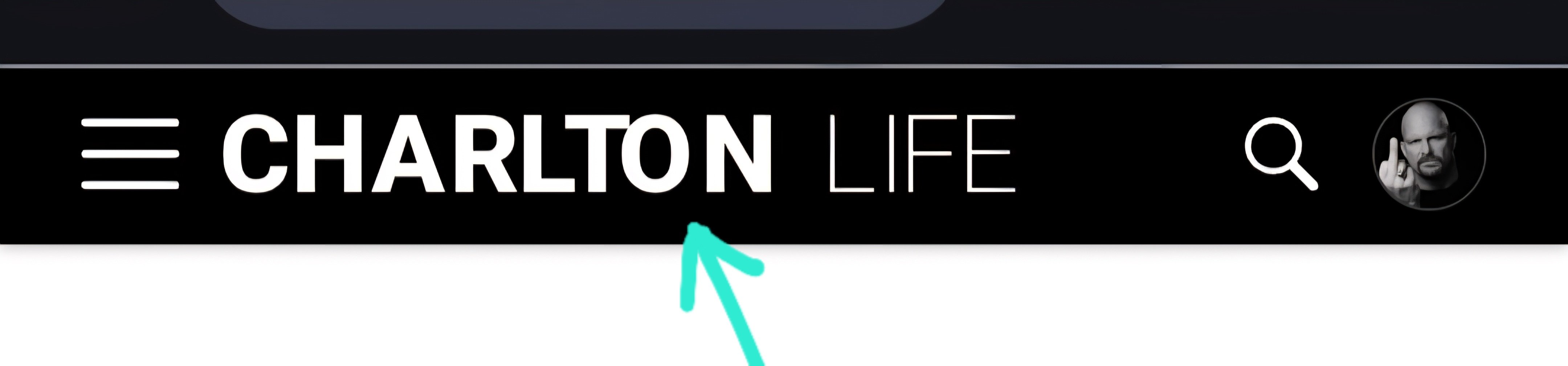
The 'O' in Charlton is out of place. Sorry to nit pick, but I keep looking at it now.3 -
Sponsored links:
-
Also could the black be a red to match our colours? Make the place feel a bit more Charlton, or maybe the Charlton crest on the end of the wording.
If I am being too picky sorry, cause everything else I actually like and think it makes the site feel more current1 -
What's a promote?Garrymanilow said:As long as the exact number of promotes is there, that's all that matters0 -
Just noticed. Looking at my profile...... I thought I'd been sent off 3 times.up_the_valley said:
What's a promote?Garrymanilow said:As long as the exact number of promotes is there, that's all that matters1 -
this is weird. I am WFH so have laptop and have screen extended to a monitorfenaddick said:
It is, the box for 6 is darker than the othersMrOneLung said:
mine is not shaded - see my screenshot in my post - which page is shaded there ?Chris_from_Sidcup said:
Not sure if i'm being whooshed here but surely this is obvious?MrOneLung said:how can I tell which page of the thread I am on ?
all the page numbers are the same
The page you are on has the box shaded in grey.
On the laptop screen can see the greyed page number but when drag over onto the monitor they are all the same colour!!!
Must be something to do with the settings on the monitor
I am not going mad, I swear !!!2 -
That’s a really weird one. It’s a SVG rather than the jpeg we had before, which means it’s crisper at all sizes but it shouldn’t move letters! It’s definitely on your end though (or at least, will only affect people with your exact browser hardware, etc).Braziliance said:I have noticed something and since I have, I can't stop looking at it.
The 'O' in Charlton is out of place. Sorry to nit pick, but I keep looking at it now.
We’ll be introducing more red and more “CAFC” elements, but likely with more liberal red accents, as opposed to making the header red. But who knows, maybe one day!1 -
That would be good, like red outlines on the letters etc,LoOkOuT said:
That’s a really weird one. It’s a SVG rather than the jpeg we had before, which means it’s crisper at all sizes but it shouldn’t move letters! It’s definitely on your end though (or at least, will only affect people with your exact browser hardware, etc).Braziliance said:I have noticed something and since I have, I can't stop looking at it.
The 'O' in Charlton is out of place. Sorry to nit pick, but I keep looking at it now.
We’ll be introducing more red and more “CAFC” elements, but likely with more liberal red accents, as opposed to making the header red. But who knows, maybe one day!
Thanks for the response, I am sure I can manage looking at it haha0 -
Just bumping this as I've not seen a response?valleynick66 said:Is this no longer optimised for mobile?
if I change font size beyond 100% I have to scroll now left and right to see all content.Sure before it just meant scrolling down only.Also (personally) I find the font a little too light to ease reading for those of us with less than 20:20 vision. You can’t beat black on white for sheer usability.
Is there a mobile and desktop version?
It looks ok but I had to zoom out a few times to get everything in. Wouldn't a mobile version do that automatically?
I know the last version had a hyperlink at the bottom to switch.0 -
A few more thoughts for you @LoOkOuT. Before I get into them, lots of improvements I can see, and I'm obviously not listing them out. But good job so far!
Chrome, android mobile...
Name of poster, and time of post, is unnecessarily small. Or possibly a better way to consider it, isn't in keeping with my general font size preferences on my phone, which I'm assuming is what the thread content is doing? Potential tweak there.
The ever-present button to create a new thread. I'd rather be inconvenienced and have to go and find that button, rather than it be ever-present. Suspect I'm in a big majority who reply often but who rarely start threads, so the shortcut is an unnecessary distraction.
On top right of screen, the site search icon doesn't respond when I'm on a thread. It does respond when I'm on the home page.
My use of the site, when catching up on threads with 100s of unread posts, I skim read and only read the well-liked or well-lolled posts. They're now harder to pick out, previously were unmissable. A number of ways a prominent post could be highlighted or filtered, I'm sure you'll have some options.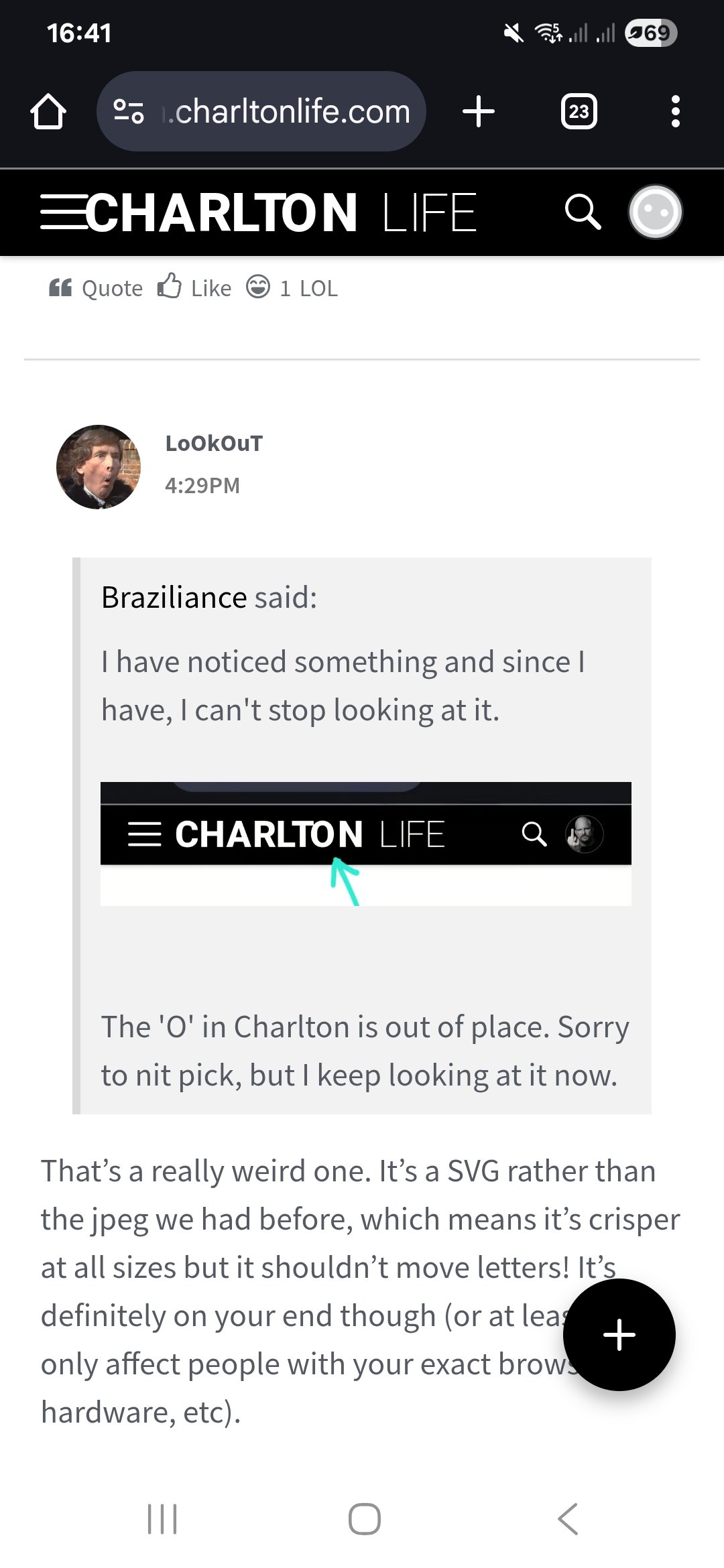
3 -
For someone who scrolls with their right hand on my iPad, the switch to all the menu stuff on the right of the main page is very annoying.
But I’m sure I’ll get used to it.0 -
When looking at All discussions, it has the old yellow and grey to indicate which posts you've read, etc. When I click on General Charlton, it's just black and white, Can that ability be returned to General Charlton?1
-
Sponsored links:
-
The fontsize on my desktop is smaller than the old version, occupying only about half the screen. Is this a Charlton Life issue or do I need to set this on my computer? Not a total IT novice, but if anyone can give me instructions of increasing font size, expanding the page size on Chrome, I would appreciate it.0
-
*transpireseastterrace6168 said:
Fair enough Ali, I just like to keep an eye on them, it's just something I do, and from the posts above, I am not alone, we shall wait and see what transgresses...👍aliwibble said:
Nope, no dig, just puzzled as to why a few dozen here or there would make a difference when you have so many.eastterrace6168 said:
Ali...bit of a dig there eh...aliwibble said:
You've got more than 34,000 likes and 11,000 LOLs. Does the accurate figure really matter?eastterrace6168 said:Probably in a minority here, but you used to be able to hover over the likes and LOL's on the profile page and find an acurate figure, but that seems to have vanished now...🤷♂️
It's just a part of the old profile that I liked, now, it may be gone which would be a shame, but just an enquiry mate that's all...1 -
Ah, found the zoom button on Chrome, much better now1
-
Using PC.
Ok here are some of my observations...
Everything seems so bland. I really miss the CL yellow background. Posts seem to blend in to each other.
Much preferred the 'other stuff' on the left hand side as opposed to the right.
That's about it. Good job all round but i think it's missing some character.1 -
Update looks really good on my mobile and I can actually search topics and edit drafts, which i couldn't do before! Good work all.1
-
@oohaahmortimer I'm having trouble replicating this. Can we have some more details - mobile or desktop, which browser, which operating system? And how are you leaving the threads - are you hitting the back button on your browser, click on All Discussions or the Charlton Life logo?oohaahmortimer said:
still not sorted , so once a thread is opened you have to read the lot or you lose where you areoohaahmortimer said:Hopefully , I’ll be able to open a post at the page I left it , currently if I open a 30 page thread and read 10 I join at page 30 next time , so I miss out on so much shit that’s been written.0 -
Mobile looks great, desktop on Edge not so, not enough posts per page (to scan).0
-
mobile and laptop safari/ microsoft edgealiwibble said:
@oohaahmortimer I'm having trouble replicating this. Can we have some more details - mobile or desktop, which browser, which operating system? And how are you leaving the threads - are you hitting the back button on your browser, click on All Discussions or the Charlton Life logo?oohaahmortimer said:
still not sorted , so once a thread is opened you have to read the lot or you lose where you areoohaahmortimer said:Hopefully , I’ll be able to open a post at the page I left it , currently if I open a 30 page thread and read 10 I join at page 30 next time , so I miss out on so much shit that’s been written.
I'll leave the page by roland out forever1 -
Yeah, that's a strange one, was there a reason that the switch to the right was necessary...KBslittlesis said:For someone who scrolls with their right hand on my iPad, the switch to all the menu stuff on the right of the main page is very annoying.
But I’m sure I’ll get used to it.0 -
Have to agree worh those that say the yellow and red on the front page now on mobile as well as desktop is a bit rank but everything else seems ti work well, good job 😀0