Attention: Please take a moment to consider our terms and conditions before posting.
***PLEASE READ: New Charlton Life look and feel coming...
Comments
-
Weirdly the header issue I had has resolved itself!1
-
ross1 said:
I found them at the top of page 2, thanks.aliwibble said:ross1 said:Looks ok to me, but can we have page numbers at top as well as bottom.
When I go to the thread it starts on page 2 and I have to go to the bottom as I have discovered to put it to page 1. Thanks@ross1 They are?You might want to clear down your cache and then refresh the page to see if that helps.
I know I am being vain, but I used to click on to my name at the top to see how many likes and LOLs I have, where are they nowYou need to scroll down to the bottom of your profile page to the Reactions section. If you want to see which specific posts are LOL'd, click on the smiley face.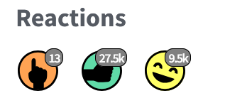
1 -
Android chrome..
Height of the bit I've highlighted below could be reduced. Also, the functionality it offers, I don't think it's that helpful, considering each individual component. I probably wouldn't use it anywhere near enough to warrant it having prime position on the webpage - unless adding a search field to the Filters pop up is in the pipeline. Perhaps worth considering tucking it behind the navigation options? There's definitely a place for a decent search tool but I'm guessing you're limited here by the host.
The Tags option in Filters - not sure what that does or how it works, might not be relevant for searching CL content?
Also, font sizes. It's hard work picking out the detail of each thread on the home page. Thread title is OK. Only speaking for myself of course, but I may be in a large group of CL users whose eyesight isn't as good as it once used to be. How many thread views and who started the thread, those could be dropped if space is an issue - or dropped just to reduce noise on the page - not sure those parameters make any difference to using the site.
The label icon to the right of each thread - what does it do, and is it useful enough to take up space on the page?
As before, just take as my two pence worth, no criticism intended.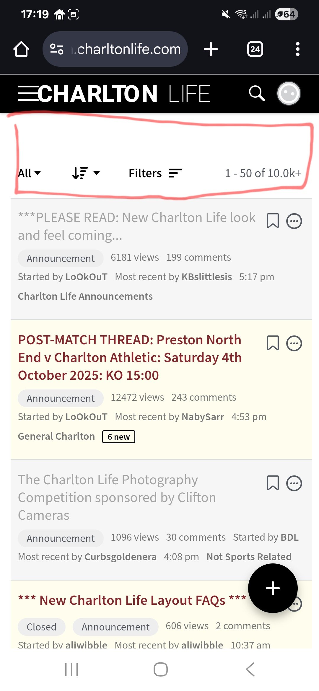
1 -
The flag function has disappeared 😂
0 -
@Er_Be_Ab_Pl_Wo_Wo_Ch the label is how you bookmark a thread, I love it. It makes it so easy to find threads that aren’t used often2
-
So it does! Thanks for setting me straight.fenaddick said:@Er_Be_Ab_Pl_Wo_Wo_Ch the label is how you bookmark a thread, I love it. It makes it so easy to find threads that aren’t used often
Looking on the pc version, when I hover it tells me what is. On the mobile site I couldn't figure it out, and of course the Bookmarks link isn't visible to give me a clue. But now that you tell me what it does, and remembering back, I did once know what it did, didn't use it, then clearly managed to completely forget what it is! But it has a purpose, that's the main thing.
1 -
@valleynick66 it should be I think, although we're having to iron out a few teething issues. Is this scrolling issue still happening? If so, can you confirm which browser and operating system you're using, and how you're changing font sizes, so we can try to replicate the problem?valleynick66 said:Is this no longer optimised for mobile?
if I change font size beyond 100% I have to scroll now left and right to see all content.Sure before it just meant scrolling down only.Also (personally) I find the font a little too light to ease reading for those of us with less than 20:20 vision. You can’t beat black on white for sheer usability.0 -
iPhone safari. Set to 125%.aliwibble said:
@valleynick66 it should be I think, although we're having to iron out a few teething issues. Is this scrolling issue still happening? If so, can you confirm which browser and operating system you're using, and how you're changing font sizes, so we can try to replicate the problem?valleynick66 said:Is this no longer optimised for mobile?
if I change font size beyond 100% I have to scroll now left and right to see all content.Sure before it just meant scrolling down only.Also (personally) I find the font a little too light to ease reading for those of us with less than 20:20 vision. You can’t beat black on white for sheer usability.I have to scroll to right to see all content. Likewise title bar squashed.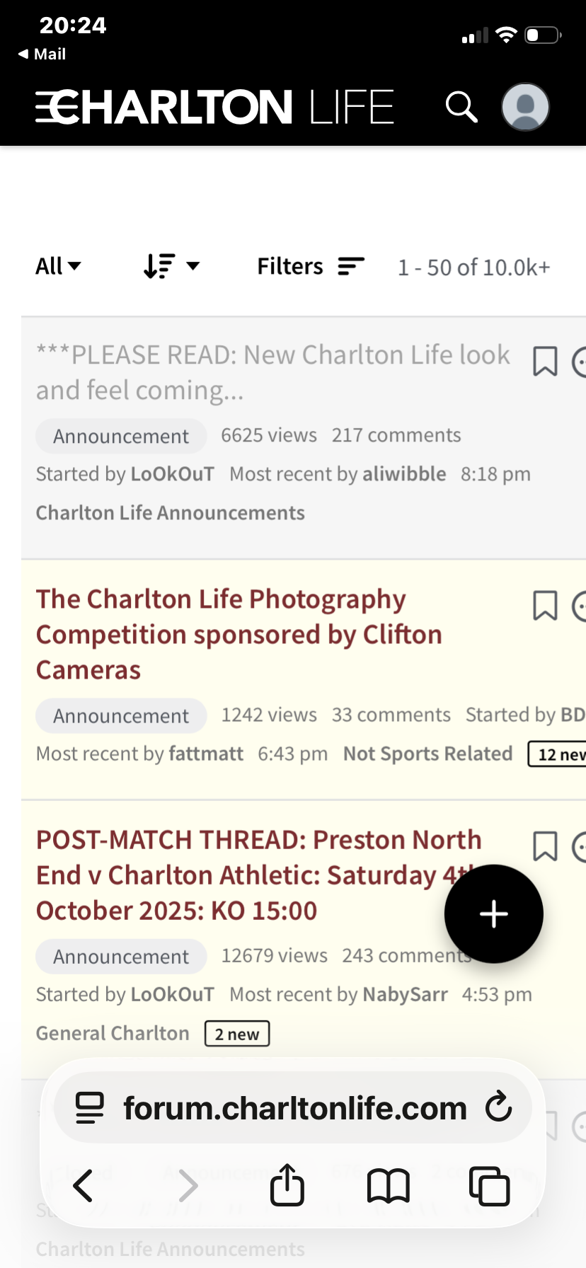 0
0 -
Not a fan of the new layout on browser with all the categories on the right feels a bit like change for the sake of change, rest will take a bit of getting used to. It's not all negatives though I do like the bookmark and mute buttons available for each thread.
Mobile view is decent to be fair but the + symbol to create a new thread is oversized and gets in the way as it doesn't move off the screen.0 -
@KBslittlesis it will feel like someone else is doing it :-)KBslittlesis said:For someone who scrolls with their right hand on my iPad, the switch to all the menu stuff on the right of the main page is very annoying.
But I’m sure I’ll get used to it.
5 -
Sponsored links:
-
Where do I find my comments?0
-
Since, it’s been raised a few times, the reason behind shifting the sidebar to the right is because the browser scroll bars are there, so it’s more efficient to put the secondary navigation links and such things there to limit the amount of travel for your mouse pointer etc and it just leaves the most high priority elements (the content) in the valuable space on the left (ie for us English-speakers, that’s where our eyes go first). In time, we’ll make the sidebar more useful.
@KBslittlesis same for touchscreen scrolling: I think you’ll like it with time as your hand is already on that side and doesn’t have to move, plus there’s plenty of margin/free space for your finger to scroll.
2 -
KENNETH!AFKABartram said:
@KBslittlesis it will feel like someone else is doing it :-)KBslittlesis said:For someone who scrolls with their right hand on my iPad, the switch to all the menu stuff on the right of the main page is very annoying.
But I’m sure I’ll get used to it.3 -
Does look a bit of a mess on iOS 26 safari on a IPhone 17 pro max if slightly magnified
1 -
Comments is not being shown…..bookmarks, drafts and my posts are but not comments?LoOkOuT said:
Top right, or wherever you see your profile pic: click/touch on the profile pic to get to your account page. On the right side you’ll see a list of links, including, at the bottom, Comments.SoundAsa£ said:Where do I find my comments?
I am using an iPad.0 -
valleynick66 said:
iPhone safari. Set to 125%.aliwibble said:
@valleynick66 it should be I think, although we're having to iron out a few teething issues. Is this scrolling issue still happening? If so, can you confirm which browser and operating system you're using, and how you're changing font sizes, so we can try to replicate the problem?valleynick66 said:Is this no longer optimised for mobile?
if I change font size beyond 100% I have to scroll now left and right to see all content.Sure before it just meant scrolling down only.Also (personally) I find the font a little too light to ease reading for those of us with less than 20:20 vision. You can’t beat black on white for sheer usability.I have to scroll to right to see all content. Likewise title bar squashed.Looks like it's a Safari / iphone problem I think, but I don't have one of those to test with. Just tried it on Chrome on Android, and this was how it looked at 150% Are you able to get Chrome on your iphone? Could you try it out and see if that's any better?0
 -
@SoundAsa£ , detailed instructions with pictures are here: https://charltonlife.vanillacommunity.com/discussion/comment/5663082/#Comment_5663082LoOkOuT said:
Top right, or wherever you see your profile pic: click/touch on the profile pic to get to your account page. On the right side you’ll see a list of links, including, at the bottom, Comments.SoundAsa£ said:Where do I find my comments?1 -
Better in chrome albeit I’m not sure what percentage I’ve zoomed too!aliwibble said:valleynick66 said:
iPhone safari. Set to 125%.aliwibble said:
@valleynick66 it should be I think, although we're having to iron out a few teething issues. Is this scrolling issue still happening? If so, can you confirm which browser and operating system you're using, and how you're changing font sizes, so we can try to replicate the problem?valleynick66 said:Is this no longer optimised for mobile?
if I change font size beyond 100% I have to scroll now left and right to see all content.Sure before it just meant scrolling down only.Also (personally) I find the font a little too light to ease reading for those of us with less than 20:20 vision. You can’t beat black on white for sheer usability.I have to scroll to right to see all content. Likewise title bar squashed.Looks like it's a Safari / iphone problem I think, but I don't have one of those to test with. Just tried it on Chrome on Android, and this was how it looked at 150%Are you able to get Chrome on your iphone? Could you try it out and see if that's any better?
certainly the menu / title bar is ok.So needs a fix for safari as the default on iPhone it seems?0 -
edit - comments found but in my 'My Posts' I get an advertising banner cutting across a big chunk of my screen cutting over my 'Quick Links' section.aliwibble said:
@SoundAsa£ , detailed instructions with pictures are here: https://charltonlife.vanillacommunity.com/discussion/comment/5663082/#Comment_5663082LoOkOuT said:
Top right, or wherever you see your profile pic: click/touch on the profile pic to get to your account page. On the right side you’ll see a list of links, including, at the bottom, Comments.SoundAsa£ said:Where do I find my comments?0 -
Sponsored links:
-
More from me, this time android tablet, chrome.
Does the menu on the right of the screen need to be a separate component and have separate scrolling than the rest of the page? Not something I've considered before, but just noticed on a tablet I scroll up and down websites more with my right thumb but it's not working well with right thumb landing on that menu and scrolling it up and down, instead of the content on the page. Gotta be a leftie for scroll up and down webpage content with the current arrangement.
But I'm a user who never clicks on Categories in that menu, nor need to know who is online, so I may be an outlier not getting much benefit from the side panel. Probably the only thing I click on often is my drafts.
Perhaps an arrangement to consider would be to keep the top elements of the side panel; do away with the Categories element as it's covered by the website header, and stick online users to the bottom of every webpage (a bit like on the bookmarks page). That way the side panel would be ever-present on the screen but scrolling it up and down wouldn't need to be a thing.
Just throwing more casual thoughts around, might be something useful in there!0 -
@MartinCAFC no, you need to go through the link on your profile page, as already explained here:0
-
Where is 'my comments?'3
-
Not sure that I'll be on here as much as before, sadly.
Don't like change ( old dog, new tricks! )
The Tingle is currently sulking.....4 -
Same here…..my comments still not showing, I have followed Lookies latest more detailed instructions (selecting my posts) but my comments still does not show up……I am using Safari on an Apple iPad.jimmymelrose said:Where is 'my comments?'
My posts is reading 542 by the way.0 -
Made a right mucky mess!LoOkOuT said:
You will be most impressed by this. You might not be able to contain yourself.carly burn said:Will there be a decent search facility on the mobile version for once!
In all seriousness, it's much improved.Well done0 -
not liking this so far1
-
Ooo the new post box has gone yellow, someone check its liver!1
-
Do polls not work?bertpalmer said:not liking this so far0


