Attention: Please take a moment to consider our terms and conditions before posting.
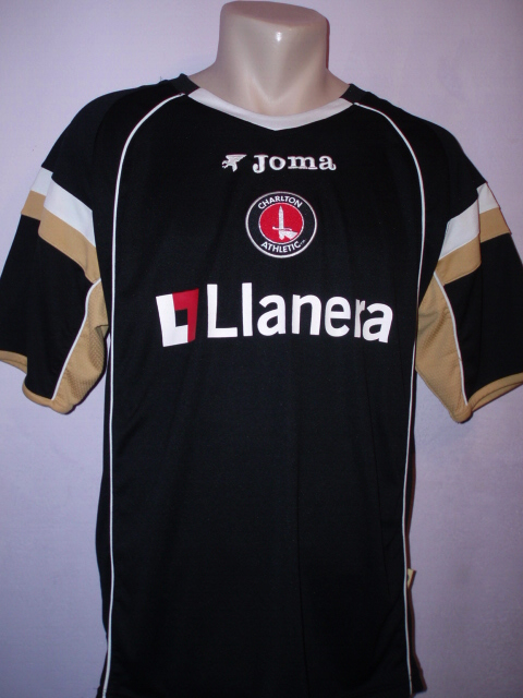
Reebok it is then (new 3rd shirt p51)
Comments
-
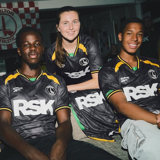
First time having a black and gold since 06/07?
1 -
We've been marketing from the endz for some time.ShootersHillGuru said:I just don’t get why we’ve chosen to pick on one nationality. Not suggesting we needed to go for an all inclusive nations shirt as SE9 kindly posted but I find what we’ve done a bit odd. Nice shirt but as far as I remember SE7 is not in Kingston. There are plenty of ethnic groups in SE London that rival Jamaica in numbers.0 -
No we had one in the Stockley years tooCallumcafc said:First time having a black and gold since 06/07?2 -
Looking forward to picking these up in the sales for a fiver1
-
I’m allergic to green so it’s a no from me.0
-
I like the home and 3rd without loving them so will probably end up with one.
The away I'd like to treat like a George W Bush effigy/American flag in Afghanistan circa 20060 -
True… I had erased that one from memory. Did not get the hype at the time and a poor team playing in it to boot.fenaddick said:
No we had one in the Stockley years tooCallumcafc said:First time having a black and gold since 06/07?0 -
It’s a real cock-upshine166 said:Still no kits for 5/6/7 year olds, how has the same mistake been made on all 3 kits ?0 -
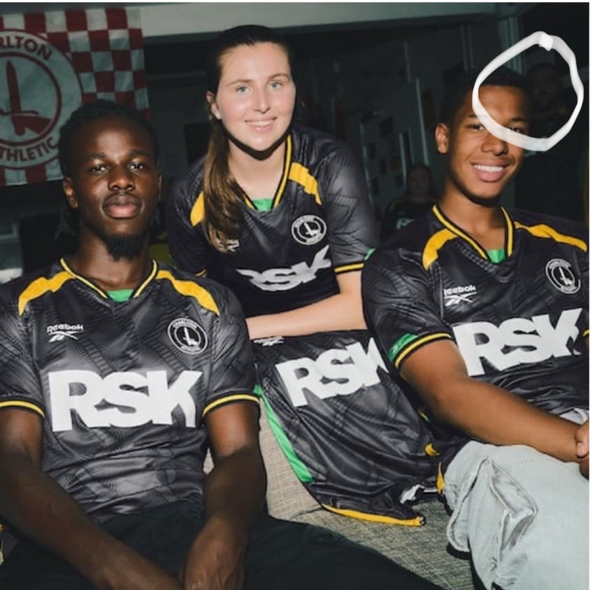
Fuck me, this photoshoot is a disaster...
Central figure over exposed.
Harsh lighting on left-side shirt.
Lighting doesn't separate subjects from background.
No focal point.
Cropped too tight.
Oh, and did you notice the ghost in the background...
Has this even be retouched?
12 -
Guardy said:I’m allergic to green so it’s a no from me.
 https://www.youtube.com/watch?v=yiYVRV2Q_uw 0
 -
Sponsored links:
-
I like it. Different for sure but think that's the one I'll purchase!1
-

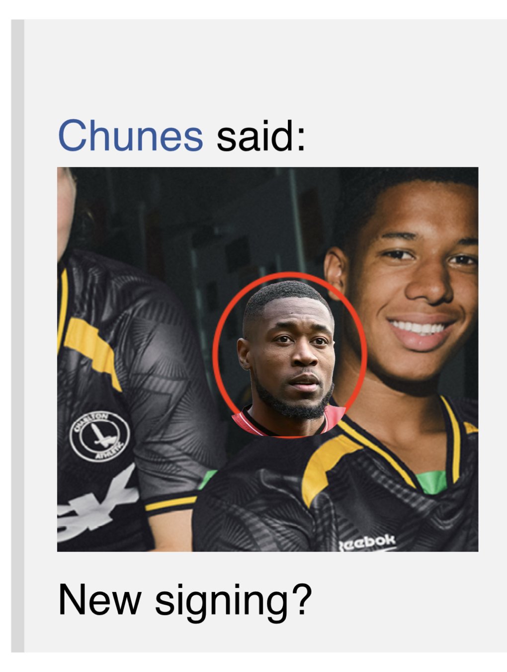
New signing?10 -
That original advert had the Who’d pub on Plumstead common in it.killerandflash said:Guardy said:I’m allergic to green so it’s a no from me.https://www.youtube.com/watch?v=yiYVRV2Q_uw
https://youtu.be/5tuVGST_1gE?si=MKWaHhRdzdUXiSD9
0 -
I reckon it's Fukuda ;-)Chunes said:
New signing?5 -
-
Call me crazy but I think it's a deliberate choice to shoot this way - the other kit reveals have been similar. Gives them what they are wanting to portray.Chunes said:
Fuck me, this photoshoot is a disaster.
Central figure over exposed.
Harsh lighting on left-side shirt.
Lighting doesn't separate subjects from background.
No focal point.
Cropped too tight.
Oh, and did you notice the ghost in the background...
Has this even be retouched?5 -
nice enough 3rd kit and the boy will love it - could've been a whole lot better.....not quite giving me Ajax vibes0
-
Logo's so big you could lay it on the floor and a helicopter could use it as a landing markerCroydon said:
The logo on this looks like those memes on twitter "for every like I'll make Ronaldo fatter". Why is it so big?Braziliance said: 6
6 -
I think this is the best of the three.The shirt sponsor is too bloody big though. It dominates the top.0
-
Sponsored links:
-
Definitely an attempt to create that raw and 'real' look, like Vice magazine ads from the early 2000s, but that doesn't excuse the execution.Callumcafc said:
Call me crazy but I think it's a deliberate choice to shoot this way - the other kit reveals have been similar. Gives them what they are wanting to portray.Chunes said:
Fuck me, this photoshoot is a disaster.
Central figure over exposed.
Harsh lighting on left-side shirt.
Lighting doesn't separate subjects from background.
No focal point.
Cropped too tight.
Oh, and did you notice the ghost in the background...
Has this even be retouched?
5 -
Like the third kit - good colour combo.0
-
For the sizing of the new Reebok kits, is the sizing similar to that of castore and Hummel?
Need to know if I need to add an extra X to my XL but living in Stockport it's difficult to get to the club shop to check the sizes0 -
I would say 100% you need to go a size up compared to previous. The sizing is ridiculously small for the Reebok kits but weirdly very long in length.cafcwill said:For the sizing of the new Reebok kits, is the sizing similar to that of castore and Hummel?
Need to know if I need to add an extra X to my XL but living in Stockport it's difficult to get to the club shop to check the sizes1 -
The ghost of Cory GibbsChunes said:
New signing?1 -
Calm down mate, you can only see her neck and a bit of arm. We’re not quite Saudi Arabia yet…Chunes said:
Fuck me, this photoshoot is a disaster...
Central figure over exposed.
Harsh lighting on left-side shirt.
Lighting doesn't separate subjects from background.
No focal point.
Cropped too tight.
Oh, and did you notice the ghost in the background...
Has this even be retouched?21 -
Went club shop and bought for one of my boys today. In person it’s a nice shirt, badly let down by the quality of the plastic for the RSK logo. It’s all a bit creasy and just looks really cheap.1
-
The quality issues people are raising with all 3 kits are making me wonder if this might be a wait for them to be on sale type thing. The material does look very very shiny and not great quality even on the player photos1
-
I think that’s more to do with the grim reaper mateCovered End said:
I was presuming it's an attempt to appeal to the local community in order to boost our attendances, especially as RBG are doing their best to deter our historic fan base.ShootersHillGuru said:I quite like it but a serious question. Why pick what is undoubtedly a national shirt (Jamaica) and what made us choose Jamaica ? I know we’ve got a few Jamaicans in the squad now and the connection with a Jamaican football club but it still seems to me to be strange to be so overtly leaning towards one nationality.0