Attention: Please take a moment to consider our terms and conditions before posting.
Terrible Football Badges
Comments
-
That's great!tangoflash said: 0
0 -
Tempora mutantur, nos et mutamur in illis, Times Change, and we change with them ( I think)guinnessaddick said:
What does the motto mean?Henry Irving said:
Thankfully we only adopted this badge for a short period in the early 60s
0 -
Okay, I'll admit this one isn't a real team. A few years ago, myself and my brother were playing FM and we created our own clubs. This was his team and crest.Friend Or Defoe said:
That's great!tangoflash said: 1
1 -
Fair few of these in for a shout.
I can't stand the new Juventus badge, so bland and modern. Fiorentina have unnecessarily altered their badge when it looked good.
Also not a fan of Sheffield Wednesday and Inters changes, just seem totally unnecessary.
2 -
I see you stuck with Charlton.tangoflash said:
Okay, I'll admit this one isn't a real team. A few years ago, myself and my brother were playing FM and we created our own clubs. This was his team and crest.Friend Or Defoe said:
That's great!tangoflash said: 0
0 -
Not a football club but this is real.tangoflash said:
Okay, I'll admit this one isn't a real team. A few years ago, myself and my brother were playing FM and we created our own clubs. This was his team and crest.Friend Or Defoe said:
That's great!tangoflash said:

0 -
Now that is shit!0
-


5 -

1 -
Sponsored links:
-
Many clubs have gone for round badges now to fit in with social media accounts, in the name of "legibility" which is slowly killing off any uniqueness0
-
A couple from Spanish lower leagues
C D Campello Athletico de Catral
0 -

2 -
Bet they spent 500k on an agency to come up with that too1
-
Red is a bit brighter, looks like a gold line down the middle has been removed. Maybe the typography circle is a little larger. Blimey would have liked to get that job, charge thousands and slightly tweak the existing one.1
-
I watched the Millwall v Charlton 1970 highlights on Youtube the other day.
I never before realised that Millwall used Lenny the Lion as their badge - as seen here modelled by Derek Possee.

9 -

The new Cambridge Utd badge as proposed last year.
The options now on the table for U's fans
The original idea (which I assume got the thumbs down from said fans) isn't terrible as such, but given the rich history of that city, it's rather dull. Just having initials has always struck me as lazy even when presented in a more artistic way (Leeds 1970s for example).
Of the new choices, 1 keeps the crenelleations (which represent the Magdelene bridge, I have discovered) 2 is a nod to their past as Abbey Utd and to the city's architecture and 3 is the 1970s book and ball design revisited.
Of the three, two is the best of a bad bunch for me.
5 -
Quite like No.3 if I had to choose one of them - The book being a nod to the University.2
-
They should have retained the font from the original, as that is excellent, but I would go for 10
-
I have studied these badges comprehensively and have decided I really couldn't give a monkeys what they choose as its still not a patch on ours.6
-
Sponsored links:
-
The round one is getting there. The colours are all wrong, should be red, white and black borders, they have rather stupidly put a "U" in CAFC instead of the "A" and there is not a bloody clentched sword in sight.
Keep working on it lads, seat of learning my arse!2 -
 Plymouth’s badge looks like a blue peter badge4
 -
... as designed by the late, great Tony Hart.0
-
I think you will find it was actually Morph.Stig said:... as designed by the late, great Tony Hart.1 -
Is that one you made earlier?EugenesAxe said: Plymouth’s badge looks like a blue peter badge7
 -
The old style badge on the shirt and all white kit was by far better,even if it was Millwall.Raith_C_Chattonell said:I watched the Millwall v Charlton 1970 highlights on Youtube the other day.
I never before realised that Millwall used Lenny the Lion as their badge - as seen here modelled by Derek Possee.
 2
2 -

The new Charlton Life badge looks a bit unique.4 -
Not a badge, but a graphic.
What was the score of the game below? 1-1 right?
Nope 0-0
1 -
Sheffield Wednesday have just done the same as Man City and gone back to a previous (and better imo) badge.Braziliance said:Fair few of these in for a shout.
I can't stand the new Juventus badge, so bland and modern. Fiorentina have unnecessarily altered their badge when it looked good.
Also not a fan of Sheffield Wednesday and Inters changes, just seem totally unnecessary. 0
0 -
Peterborough's new badge:

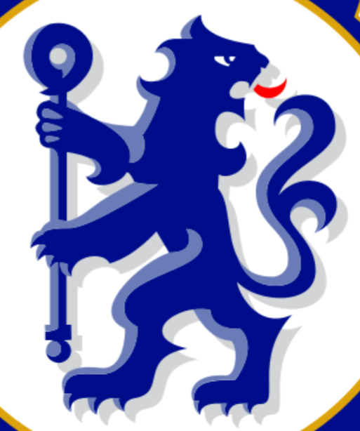
Wonder how much they paid an agency to basically copy Chelsea's:
0


