Attention: Please take a moment to consider our terms and conditions before posting.
Castore kits thread (24/24\5 3rd kit page 83/84)
Comments
-
I was expecting to see the Windows Xp logo appear near the bottomMendonca In Asdas said:
Expect to see Tinky Winky running over the hill in a minute!shine166 said:Current squad looks great in it 1
1 -
9
-
They're both gorgeous. Yes please.3
-
They have taken a bit of a risk with the top one - the R, the S, and the K.Talal said:3 -
That white one is mustard2
-
Erm, I think it’s white?CAFCsayer said:That white one is mustard15 -
If it's based on the 98-99 it's ecru.11
-
That 98/99 concept one is great, think fans would be well happy with something like that. Think we might see a collar on at least one of the shirts the way Castore do their stuff.5
-
I like those!0
-
Sponsored links:
-
I think you mean the ecru one is spiffing.CAFCsayer said:That white one is mustard2 -
I sometimes see the plenty of shots twitter account share goals from back in the late 80s. The all yellow kit with the red trim when we had Woolwich as a sponsor was quality imo. I was only 6 at the time so it could’ve been a third choice kit behind the gray? Anyhow, I would like to see something like that come back
I think black kits are are a horrible choice. Don’t see the appeal at all personally.0 -
Isn't the leisure wear market the driver? Let's face it, red is not necessarily the colour of choice for blokes for a trip down the pub. Yellow would be in the same category. Black, maybe white, blue, ecru, grey and other less "in your face" colours are a better match with a pair of jeans.cabbles said:I sometimes see the plenty of shots twitter account share goals from back in the late 80s. The all yellow kit with the red trim when we had Woolwich as a sponsor was quality imo. I was only 6 at the time so it could’ve been a third choice kit behind the gray? Anyhow, I would like to see something like that come back
I think black kits are are a horrible choice. Don’t see the appeal at all personally.2 -
I guess so, but I don’t see my club’s football shirt as something I’d wear as leisure wear. That’s just my choice, but I loved some of those old kits like the yellow and gray ones from the late 80s. I know they brought the gray one back again the other season, but it just didn’t have the same appealcafcfan said:
Isn't the leisure wear market the driver? Let's face it, red is not necessarily the colour of choice for blokes for a trip down the pub. Yellow would be in the same category. Black, maybe white, blue, ecru, grey and other less "in your face" colours are a better match with a pair of jeans.cabbles said:I sometimes see the plenty of shots twitter account share goals from back in the late 80s. The all yellow kit with the red trim when we had Woolwich as a sponsor was quality imo. I was only 6 at the time so it could’ve been a third choice kit behind the gray? Anyhow, I would like to see something like that come back
I think black kits are are a horrible choice. Don’t see the appeal at all personally.0 -

8 -
The third kit this year was probably the nicest we have had in years. Thought the black with gold was a quality design.cabbles said:I sometimes see the plenty of shots twitter account share goals from back in the late 80s. The all yellow kit with the red trim when we had Woolwich as a sponsor was quality imo. I was only 6 at the time so it could’ve been a third choice kit behind the gray? Anyhow, I would like to see something like that come back
I think black kits are are a horrible choice. Don’t see the appeal at all personally.7 -
I prefer either white or yellow for an away top.1
-
It was a good shirt, aside from the weird lighter panel across the collar bone and manboobs!SouthWest_Addicks said:
The third kit this year was probably the nicest we have had in years. Thought the black with gold was a quality design.cabbles said:I sometimes see the plenty of shots twitter account share goals from back in the late 80s. The all yellow kit with the red trim when we had Woolwich as a sponsor was quality imo. I was only 6 at the time so it could’ve been a third choice kit behind the gray? Anyhow, I would like to see something like that come back
I think black kits are are a horrible choice. Don’t see the appeal at all personally.2 -
The only good thing about last season was our kits, especially the third. Let's hope that this lot reach the same standards.0
-
Something tells me a top will be £60 plus.1
-
Sponsored links:
-
Castore cricket sunhats in the Lord's shop today were £30...3
-
https://www.chroniclelive.co.uk/sport/football/football-news/newcastle-united-castore-club-shop-23113723
second store in Woolwich or down at the O2 ?0 -
There already putting the store at the O2 together, so I suspect they’ll stock a tiny amount of Charlton stock at the backRichmondSE10Exile said:https://www.chroniclelive.co.uk/sport/football/football-news/newcastle-united-castore-club-shop-23113723
second store in Woolwich or down at the O2 ?1 -
Both England (cricket) and Charlton are still unbeaten in Castore kit5
-
The non playing stuff looks good for England Cricket, I’d rather buy a decent top at my age, then a playing shirt, so looks like they’ll be decent stuff to buy0
-
I don't like the Castore England Test shirt, the lack of buttons look odd for a cricket shirt. But do it in red, and it would make a decent Charlton shirt though
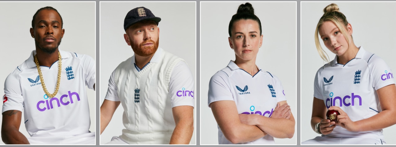
The Kent Castore shirt is more traditional looking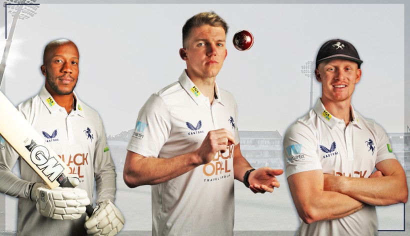
0 -
Quite like the one top right ...killerandflash said:I don't like the Castore England Test shirt, the lack of buttons look odd for a cricket shirt. But do it in red, and it would make a decent Charlton shirt though
The Kent Castore shirt is more traditional looking 0
0 -
Cricket whites should never be pure white, they always look horrible. The Kent kit is finekillerandflash said:I don't like the Castore England Test shirt, the lack of buttons look odd for a cricket shirt. But do it in red, and it would make a decent Charlton shirt though
The Kent Castore shirt is more traditional looking 0
0 -
Cricket trousers and cricket sweaters should never be white; but white cricket shirts are ok.Pelling1993 said:
Cricket whites should never be pure white, they always look horrible. The Kent kit is finekillerandflash said:I don't like the Castore England Test shirt, the lack of buttons look odd for a cricket shirt. But do it in red, and it would make a decent Charlton shirt though
The Kent Castore shirt is more traditional looking 0
0


