New Kit 18/19 season
Comments
-
This.MrOneLung said:I like it
Stripes need to cross over to get the red of the badge in between the two stripes
The width of the lines = the diameter of the red circle in the badge. It's clever really.1 -
No joke here, it was so different and bold, an immediate classic IMO.Covered End said:
I hope you're joking. The green & purple shirt was the worst ever in my opinion. Do I not like green.sam3110 said:However, I like the overall appearance of the kit, and I'm hoping the use of white will mean a new third kit, in green and purple
I'm expecting us to utilise a black kit that doesn't go on sale for the third kit, or last seasons blue kit2 -
No strong feelings about the new 2nd kit one way or the other. Makes Solly look as though he has a beer belly. Didn’t I read somewhere that last year's blue second kit would become this year’s third kit?0
-
And that is why I didn't understand it.Leeds_Addick said:
This.MrOneLung said:I like it
Stripes need to cross over to get the red of the badge in between the two stripes
The width of the lines = the diameter of the red circle in the badge. It's clever really.1 -
I really like it, only white shorts away from being perfect.0
-
Loving the shorts with that red piping.0
-
Hummel have been brilliant so far - unique designs that pay homage to the club's history and we haven't had any identikits from their other clubs / nations.8
-
Nah the black shorts are better.cafc_harry said:I really like it, only white shorts away from being perfect.
Hopefully means we can start wearing black shorts as a change from the white rather than going with an all red strip as we seem to have to once or twice a season.6 -
Like it from the nipples down. The crossover is hideous.0
-
5 stars from me.0
-
Sponsored links:
-
Hope to god we dont see Charlton wearing all red for away games next seasonCallumcafc said:
Nah the black shorts are better.cafc_harry said:I really like it, only white shorts away from being perfect.
Hopefully means we can start wearing black shorts as a change from the white rather than going with an all red strip as we seem to have to once or twice a season.
HATE IT... HATE... HATE IT!!!1 -
Not sure is my first impression4
-
Crossover - Wrong
Hummel - Wrong place
Badge - Wrong place2 -
I think that's the best bit.ShootersHillGuru said:Like it from the nipples down. The crossover is hideous.
0 -
You like nipples ?Talal said:
I think that's the best bit.ShootersHillGuru said:Like it from the nipples down. The crossover is hideous.
4 -
I like it0
-
The Roland out tag on the bum of the shorts is good.2
-
It's you that keeps mentioning them.ShootersHillGuru said:
You like nipples ?Talal said:
I think that's the best bit.ShootersHillGuru said:Like it from the nipples down. The crossover is hideous.
0 -
I always have a big problem with kit suppliers name being above the badge, and its probably why I dislike central badges on shirts0
-
Strange how we all think differently
I like Hummel kits but I think this is an absolute shocker and can’t believe no one else seems to think the same!3 -
Sponsored links:
-
Not as nice as the Quaser shirt that inspired it, but it's alright.1
-
All football clubs these days rinse their fans for as much as possible. The days of having the same kit into a following season have long gone.0
-
.
 0
0 -
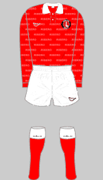
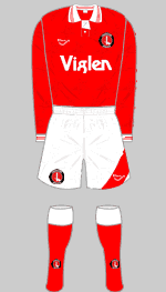
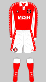
If the home kit is inspired by the home Quaser kit from that time, we'll be ok for design, but that had a middle badge, as well.
You can take risks with the away kit, but this is all a bit confused, and I'm a huge proponent that we always wear white away.0 -
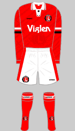
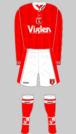
Seeing that they're going with the hashtag #90's inspired I wonder if it'll be the same for the home kit
In which case we can probably expect something similar to one of the following: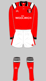
 0
0 -
The original one that went with the black/red stripe away kit didn't have a middle badge.Rothko said:If the home kit is inspired by the home Quaser kit from that time, we'll be ok for design, but that had a middle badge, as well.
You can take risks with the away kit, but this is all a bit confused, and I'm a huge proponent that we always wear white away.0 -
I love it! Very very nice ! Reminds me of I think 94/95 away kit1
-
Think it looks shite.
But it's a kit - can't say I care that much.1 -
Oh I'm thinking of the grandad collar one. You're right, had a badge in the right place, just a weird button set upTalal said:
The original one that went with the black/red stripe away kit didn't have a middle badge.Rothko said:If the home kit is inspired by the home Quaser kit from that time, we'll be ok for design, but that had a middle badge, as well.
You can take risks with the away kit, but this is all a bit confused, and I'm a huge proponent that we always wear white away.0 -
Anyone able to mock up a version with an off centre badge for comparison? :-)0