Attention: Please take a moment to consider our terms and conditions before posting.
New Kit 18/19 season
Comments
-
Nike are really lazy at the moment, the way they recycle designs.Callumcafc said:
It's strange though that they seem to put more effort into the training kits. The England one was a massive seller as it was far more iconic than the match kit 8
8 -
Yeah that's quality.killerandflash said:
Nike are really lazy at the moment, the way they recycle designs.Callumcafc said:
It's strange though that they seem to put more effort into the training kits. The England one was a massive seller as it was far more iconic than the match kit
Think the red kit is quality as well, with the St. George's cross subtly on the front.
But they just seem to be getting lazier and lazier. At least they're out of their grey sleeves phase.2 -
I would be happy to pay a premium (£5/£10) not to have the sponsors on the shirt.3
-
-
Yellow and blue!!!!!!!!!!!!!!! Prayers answered!!!!!!!!!!!!!0
-
Why have they put black on the top?!!! Surely it should be blue9
-
Was just about to say the same. Thrown together.ValleyGary said:Why have they put black on the top?!!! Surely it should be blue
Not a huge fan of Hummel’s offering this year. Last season’s home Kit was the best in years. These three look muddled imho. A perfect refelection of the club though I suppose.2 -
Shame, I prefer that yellow kit over the away one... Lovely shade of yellow too3
-
It is a catalogue kit, so there is probably no yellow with blue trim for the shirt, but there are blue shorts and yellow and blue socks.1
-
Maybe they weren't allowed to change the betdaq logo to blue, and as most people will buy the shirt but not the whole kit, it makes sense to have the shirt's accent colours all black.3
-
Sponsored links:
-
Great looking shirt again...but just one thing for me,why are the chevrons (blue) on the socks dif to those on the shirt (black),looks a bit all over the place as a whole kit...0
-
^ I do agree it looks odd having black on the top, but blue elsewhere though0
-
love the colours, but agree with the black on the shirt, plus if the badge is on the side, why isn't the Hummel on the other side, looks wrong in the middle1
-
Thought so as it looks very much like that white kit we wore in Ireland last yearRoss said:It is a catalogue kit, so there is probably no yellow with blue trim for the shirt, but there are blue shorts and yellow and blue socks.
0 -
My first thoughts too.ValleyGary said:Why have they put black on the top?!!! Surely it should be blue
Maybe last season's keeper top being recycled.
But like it other than the black trim.1 -
https://www.cafc.co.uk/news/view/5b55ee6ee9cef/charltons-201819-third-kit-revealed

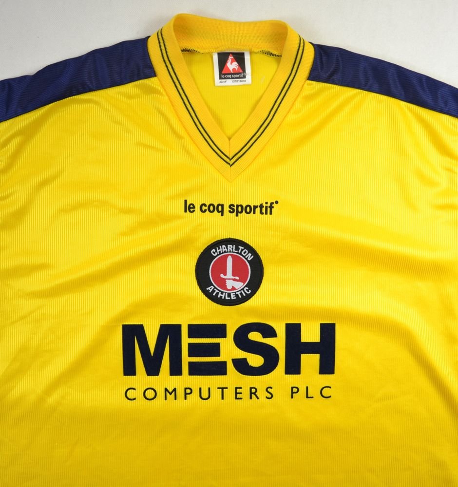
Charlton Athletic have revealed the third kit which will be worn during the 2018/19 season.
Last week saw the unveiling of our new home and away hummel strips, both of which were inspired by popular Addicks kits worn during the 1990s.
The yellow and blue strip, modelled by Chris Solly, will only be worn when necessary, against teams who sport red and white on their shirts, meaning Charlton will begin their season against Sunderland at the Stadium of Light in the striking outfit.
Unlike the home and away kits which are both bespoke and had been designed based on consultation with supporters, the third kit is, like last season’s white number, from hummel’s catalogue of designs.
The yellow shirts carry hummel’s distinctive chevrons down the sleeve in black and are complemented by blue shorts with yellow trim and yellow socks with blue trim. Originally, the Addicks were due to wear their new white away kit for Tuesday evening's friendly clash against Brighton & Hove Albion at The Valley, but will now take to the SE7 turf in the new third strip. Tickets for the pre-season match are available to purchase by clicking here.
It will be the first time that the club have worn yellow as a change strip since the period between 2003 and 2005 during which Charlton recorded their highest Premier League finish of seventh.
Unlike last season, a limited number of this year’s third kit will be available to purchase from the Valley Superstore online and in person from Wednesday, August 1st.
Adult shirts will be priced £45, while shorts will be available for £25 and socks £12.
Meanwhile, kids’ shirts will be priced £35, with shorts priced at £18 and socks £10.
2 -
fair enough if it's a catalogue kit....will only be needed a couple of times.
I'd have preferred those colours as the away kit though in a proper bespoke design3 -
Catalogue kit, by admission - so this one isn't bespoke.ValleyGary said:Why have they put black on the top?!!! Surely it should be blue
0 -
Like both away kits...particularly the vibrant yellow/blue get up. Chris looks happy enough in it.
Home shirt is a bit of a yawn.0 -
If it’s a catalogue top then have black shorts and black chevrons on the socks. Look crap having different coloured pipeing4
-
Sponsored links:
-
I like that , smart0
-
Badge looks a bit weird off centre when Hummel is in the centre. This may have been better:
 2
2 -
can’t work out if i love it or hate it...0
-
Home Kit - 9/10
Away Kit - 7.5/10
Third Kit - 5/10
My favourite home kit in years with a unique and interesting away kit1 -
The only issue with that is Sunderland have black shorts, so we couldn't have worn black shorts when we wear it against them.ValleyGary said:If it’s a catalogue top then have black shorts and black chevrons on the socks. Look crap having different coloured pipeing
Maybe all yellow would have been better.2 -
Can't believe we've got a St Truiden kit ;-)5
-
Happy enough with the 3rd kit as a catalogue one, only worn sporadically.
Agree that the badge placement looks silly, maybe they were going to place it centrally but after reading the comments on this thread from a certain individual about how awful central badges were, moved it to the side...0 -
Home kit is quite nice, away I’m not convinced on, the third is pretty good. Will buy all three when 2sheds departs1
-
I'd agree with these scores, black chevrons don't work with blue shorts.Pelling1993 said:
Home Kit - 9/10
Away Kit - 7.5/10
Third Kit - 5/10
My favourite home kit in years with a unique and interesting away kit
As a side note I loved last season's third. Simple yet classy.1 -
Unreal people can be picky considering the god awful shit tops we have turned out from Joma and Nike in past 15 years.5