Attention: Please take a moment to consider our terms and conditions before posting.
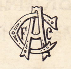
Is this the earliest Charlton Athletic symbol?
Henry Irving
Posts: 85,420
Comments
-
Interesting design0
-
Looks like a badge from an American Baseball side like the New York Yankees combined with the Cincinnati Reds0
-
I like it.
I'd like to see it revived in some form.2 -
It would look great on some black and white scarves.6
-
just goes to show that coherent logo design is not a brand new trade .. I like the allusion to a lucky horseshoe in the shape of the 'C'0
-
It looks like the Rangers oneForeverAddickted said:Looks like a badge from an American Baseball side like the New York Yankees combined with the Cincinnati Reds
2 -
I see a fish in the C.
Plenty more where that came from.8 -
Wasn't something very much like that still in use in things like programmes and club handbooks from the 50s or 60s? I'm sure it looks familiar from that period.0
-
Looks remarkably like Rangers scroll crest, which I've no doubt will please loads on here.1
-
Sponsored links:
-
The question is whether it was a logo peculiar to Charlton or a generic printers design.
Will look at the other early year books (the museum now have scanned copies of all the PRE-WW1 hand books) and see what there is.1 -
Is extremely similar... Wonder if thats why it was changed?Stig said:Looks remarkably like Rangers scroll crest, which I've no doubt will please loads on here.
0 -
Good question. It might be worth contacting other clubs' museums to see if they have anything similar.Henry Irving said:The question is whether it was a logo peculiar to Charlton or a generic printers design.
Will look at the other early year books (the museum now have scanned copies of all the PRE-WW1 hand books) and see what there is.
I seem to remember that you had a pennant a while ago and some ebay trawls found that it was a generic thing as both Arsenal and Palace had remarkably similar.0 -
The logo doesn't appear again although I realised we are missing the 23/4 handbook
No other logos or badges are used in the hand books although we know the club used the C A F in in Club design.0 -
Was it worn on the shirts or just printed in the handbook ?0
-
Just the handbook0
-
Interesting. Didn't we play with the crest of some Greenwich nobility at a point in our very early history or have I completely imagined that ?Henry Irving said:Just the handbook
Edit - we used the crest of the Met. Borough of Greenwich (but not on our shirts) in the 1940/50s but the crest in the hand book long predates that.0 -
60sse9addick said:
Interesting. Didn't we play with the crest of some Greenwich nobility at a point in our very early history or have I completely imagined that ?Henry Irving said:Just the handbook
Edit - we used the crest of the Met. Borough of Greenwich (but not on our shirts) in the 1940/50s but the crest in the hand book long predates that. 0
0 -
I think it would look good on a cap perhaps a museum initiative, certainly a striking design and it was great to find it in the handbook, I just wish I had seen it before I got the war memorial carved :-(1