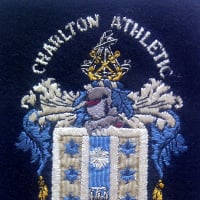
A fascinating article, Stig, packed with interesting detail. I had assumed the badge and the nickname were both much older inventions, partly because to me it would be inconceivable to change them. I especially like our sword, with the thrusting strength of the vertical blade (almost phallic!) offset by the curved flourish of the cross-guard.
Excellent article. I guess the final question is why we chose the sword from the City of London crest? It's not as if we're the official club of the square mile...
Was it the idea of some City based Addicks to bring the club closer in image to where the money is? And what has happened to City Addicks lately
I was sure that I'd read something along those lines; that the club wanted to attract new support who worked in the city (how that would have worked I've no idea). When I looked for some evidence of this, the only thing I found was written by me anyway. I could hardly go around quoting myself, so I didn't put it in. If anyone's got any genuine evidence that this is what did or didn't happen, it would be greatly appreciated.
Excellent article. I guess the final question is why we chose the sword from the City of London crest? It's not as if we're the official club of the square mile...
Was it the idea of some City based Addicks to bring the club closer in image to where the money is? And what has happened to City Addicks lately
Well if it was the intention, it didn't work as we but got bugger all money from the square mile for 30 years after the new badge was produced!
Hi @Henry Irving, I found my original draft. I'm not sure what pictures were used to illustrate it though probably some old team photos. I've got parts 2 and 3 as well. I'll post these later in the week. These do have illustrations hopefully I've got them all saved.
The Club Badge
Part 1 - Bobbin Along
Whenever a Charlton team take to the pitch they are commemorating, albeit indirectly, a violent event reputed to have taken place nearly 2,000 years ago in a city over a 1,000 miles away. It's quite possible that the event didn't even happen. But the symbolism is there for everyone to see, regardless of the historical facts.
It hasn't always been that way though, as for approximately half of the matches in the club's history no badge has been worn at all. It wasn't until the 1930s that the first Charlton badge appeared; a club-shaped badge with letters CAF on its face. Quite when Charlton started wearing this badge is uncertain, but there is a nice story that the badge was commissioned to celebrate the 1934/5 promotion. Unless the Press Association have a problem with their cataloguing though, it can't be true. They have at least six pictures of players wearing the badge prior to that season finishing. The earliest being of Harold Hobbis wearing the badge before the home match with Preston in September 1932. By the time of the 1936/37 team photo, Charlton shirts were again devoid of all badges. That is the way things would stay until 1946.
The next badge used by the club was of a robin perched on top of a football and was even more short-lived; at least in terms of matchday action. It famously made its debut in the 1946 cup final and was later used for a few international friendlies. There are reports that it was used in 1946-7 for league but not cup matches; photographic evidence of this seems to be in short supply though. Although the badge did not last long on team shirts, throughout the 1950s players would be given a blazer with this badge on after they had made twenty first team appearances for the club. A similar design was used for many years by the supporters club, or Robins Club as it was known.
In the early sixties the club decided to use the crest of the Metropolitan Borough of Greenwich as its badge. However, before there was a chance to put it on team shirts, the London Government act (1963) was passed meaning that from 1965 Greenwich would be amalgamated with Woolwich and the badge was no longer appropriate. At one point there was a chance that Charlton would be the name given to the new borough, opening up the possibility of a new crest shared between club and council. In the event, the new borough was named The London Borough of Greenwich and Charlton looked elsewhere for a badge.
In 1963 a rebranding exercise by the club led to the sword badge that we have today. A competition was held for fans to suggest a new nickname for the club. "Addicks" had fallen out of favour with with all but a few older fans, whilst the club believed that "Robins" lacked originality and impact and wanted something a bit more thrusting and gung-ho to try and encourage new fans. Sixty-two possible nicknames were suggested and on the 27th of July the board met and decided that "subject to an appropriate emblem" the new nickname would either be The Crusaders or The Red Devils.
Presumably no-one came up with a suitable emblem because by September 1963 the club programme announced a new nickname: A name that linked our ground, The Valley, to notions of adventure, bravery and gallantry. And so, despite the lack of originality in choosing a name that Port Vale had been using since 1919, we became "The Valiants". The emblem that was chosen to go with this nickname was the sword and from the start of the following season the team played in a predominantly white kit with the sword emblem on the chest. The nickname never really caught on, but the sword has gone from strength to strength.
This raises a question though; where did the sword design come from? According to an old copy of Football League Review*, “The silver dagger held by a hand and set against a red background was adopted from part of the London County Council coat of arms”. Even the most cursory glance at the LCC's coat of arms shows this to be wrong though: the crest named has no sword or dagger, in fact no cutting device at all. However, if we assume that what they really meant was City of London Crest, suddenly it looks a very good bet. The City of London sword is very similar to ours: Both have a broad blade, both have a similar hilt to blade ratio and both feature an s-shaped cross-guard; the left "quillion" facing up and the right facing down. With all these similarities, it would be quite some co-incidence if our sword wasn't based on the City Crest. So, if that's where we got our sword, where did it come from before that?
Finding out about the history and meaning of the City of London Crest is more difficult than for those of many other cities. This is because the College of Arms that records such matters, didn’t exist before 1483; over one hundred years after first use of the city's crest. In fact official arms weren’t granted to the City of London until 1957.
There was a popular story that the sword was actually a representation of the dagger that murdered Wat Tyler during the Peasants Revolt. However this cannot be true as there is evidence of the crest being used several months before Tyler’s demise in June 1381. It is now almost universally accepted that the sword on The City of London Crest is the sword of St Paul. This is placed against the flag of St George. The reason being that St Paul is the patron saint of London; by placing his sword over the English flag it shows that London, not Winchester, not Colchester, and not some other lesser town is the nation's capital.
You might imagine that a saint would be a peace loving man. Probably not the sort of person that would go around wielding a great twin bladed razor. And you may well be right. But St Paul's sword isn't representative of how he lived but of how he is reputed to have died. St Paul was a Christian martyr and was, according to that tradition, put to death by the sword in Rome in approximately 60AD. There is, however, no historical evidence of this. Although this was the usual way that the Roman state executed their enemies at that time, the last source we have of any repute has him placed under house arrest. Maybe he was put to death by the sword, maybe he wasn't. Whatever the case, it is the symbolism of that "event" that we wear on our shirts today.
Jon Laysell
With thanks to Ben Hayes, Gordon Jago and Matt Wright.
-------------
* Football League Review 1969-70, Volume 4, No.406.
Excellent article. I guess the final question is why we chose the sword from the City of London crest? It's not as if we're the official club of the square mile...
a story I’ve posted before elsewhere about a night out in town which batted on and ended up in a hostelry in south london. Getting home much later I realised I’d lost a cufflink, one of a pair with the City shield with sword. A few days later it made its way back to me as it was assumed it was a ‘Charlton’ cufflink and must have been mine because the regulars were mostly millwall fans.
Whilst I love our badge because I've grown up with it, in hindsight it's a shame we didn't just take the whole of the central shield with the sword in the top left quadrant - very smart and very marketable!
...I've got parts 2 and 3 as well. I'll post these later in the week...
Well, that was a long old week but here goes...
If you know your ‘istory: Charlton Athletic’s Badge
Part 2 - Live By The Sword
We left Part 1 of this article in 1963, with Charlton getting a new nickname, The Valiants, courtesy of a fan competition. And shortly after that a new badge, the sword, courtesy of the City of London crest. Next year [2013] will be the 50th anniversary of Charlton using the sword as its emblem. In Part 2, we explore how the sword badge has developed.
Everywhere and Nowhere
Everywhere you look around Charlton Athletic you will see the sword badge. It appears, on all three kits worn by the players; not just on the shirts, but on the shorts too. At various times the sword has even put in an appearance on the socks. There's a six metre high badge on the back of the Covered End in Harvey Gardens, whilst the other three stands all have rooftop badges facing the pitch. Tickets, letters, advertisements and the club website all carry the brand, even the corner flags are smartened-up with the famous badge. If you look in a typical match-day programme, you are likely to see some 30-40 images of the crest.
You might think that with this level of ubiquity, the badge has always been this important to the club. The truth however is quite a different story. It actually took quite some time for the badge to become established.
Start Me Up
The 1964-65 season is the first time that the Charlton team took to the field with swords on their chests. The kit that season (and the next) being quite a change from the traditional one; for only the second time in history the home shirt wasn't all red. Instead it was predominantly white with a red panel over the shoulders. Its badge, a red sword on a white background enclosed by a single white circle.
This was a pretty significant change and you might imagine that the club would make a bit of a song and dance about it. Well, not really. This is what they said in the programme: Nothing. That's right, for a whole season of league programmes, not one comment was made about our new badge or our new kit. The only written proof of any change is on the team sheet page which for every match carried a bland description of what the team would wear that day. Presumably in those days, before there was any money to be made through the sale of replica kits, the club felt no need to mention it. It would be interesting to know what Charlton fans of the time made of the change; if anybody thought to ask though, they certainly didn't record the answer.
Charlton's use of the badge on team shirts was very sporadic in the early days. In some seasons there was a sword in a circle, some years just a sword, in four seasons the badge was dropped in favour of initials and in another three seasons the shirts were completely bare. It wasn't until as late as 1980 that the current unbroken run of wearing the sword on every shirt was started.
Not only was there no consistency with the use of the badge on the shirt, but there was no tie-in with other items either. For example, 1967-8 was the first season that the sword badge appeared on a programme cover, it also appeared that year (possibly for the first time) on the front of the handbook and returned to the team shirt following a year's sabbatical. This seems quite consistent use, until you consider that the badge on each item was a completely different design. The sword on the shirt was red on a circular white background. The handbook and the programmes both went for an etched design with the nickname of the day, The Valiants, written across the centre - however each publication had a different sword design! It's easy to see why there might be a difference in the shirt badge and the printed badge because the technologies of the day were limited (at least at a reasonable price). Consequently, what could be printed onto paper could not necessarily be embroidered onto material and vice-versa. It is rather more difficult though to explain having different swords in the programme and the handbook. Whether it was due to indifference or perhaps some internal duel over which sword would become our excalibur, perhaps we shall never know.
The following season's programmes, 1968-9, featured for the first time a badge which was essentially the same as the one we had today. Still the only consistency in the club's use of the badges though was its inconsistency; the home kit was completely red with no hint of another colour on it and no badge whilst the handbook used the same old etched badge as the previous year.
Round and Around
The 1968-9 programme version had a new design element as well as the sword: Red and black roundels with the the club's name set into the outer ring. It is interesting to consider where these might have come from.
One of the things that makes Charlton different to most other London clubs is that, until the recent extension of the Jubilee Line, it has been nowhere near a tube station. In the past many supporters would have made their way to matches using trams and trolleybuses. The trolleybuses were serviced in Charlton and when the last ones were phased out in 1959 it was at Cohen's in Penhall Road where they were scrapped.
At this point, you'd be right to wonder what this has got to do with Charlton's badge. The rather disappointing answer is, probably nothing. But the similarities between the Trolleybus logo and the new Charlton badge are too great to just ignore.
Both have the same roundel pattern, including trim, and both have a light upright shape in the middle. There is no evidence (at least, not that I've found) of a direct link between the two badges. With such similarities though, I can't help but wonder whether the designer of our badge might have been influenced, albeit unconsciously, by the sight of the trolleybuses lined up to meet their doom.
Sign O the Times
From 1968-69 onwards the familiar version with the roundels became dominant one. It has been tweaked and developed at regular intervals, but it is always instantly recognisable as The Charlton Badge. Each time it has been developed it has got a little more modern and better looking to the eye of the age. The drivers behind such updates are likely to be the same as any for other business: To keep the brand looking fresh and in vogue, to maximise the potential of new display technologies, to keep people interested, to stamp club ownership onto its assets.
There are two exceptions to this story of positive development. In the early 1980s a version of the badge was produced that quite simply didn't look as good as the versions before or after; the proportions were not quite right, the gauntlet had a withered look and the typeface bearing the club's name was incorrect. I have never seen an explanation for this, but can only guess that the original '68 designs must have become lost and that someone hurriedly put together a new inferior one. If anyone knows the true story behind this, I'd love to know. Luckily by the mid '80s things were restored to their aesthetic best, except for some reason in Junior Reds magazine which for some reason or another stuck to the inferior design for many years after.
In 1992 a new addition started appearing on the badge, the letters™. This symbol marks the badge as an unregistered trade mark. Its job was to protect it as an asset of the club as there were worries regarding unofficial merchandise bearing the club's official designs. Whether the extent of such piracy was really sufficient enough to make such a change or whether the club had heightened awareness of the issue because the Trade Marks Act of 1994 was being drafted at that time is uncertain. Either way this blot was to stay on the badge for many years.
The symbol 'TM’ "has no legal significance in the United Kingdom", so it may may have been employed just as a warning to any pirates that this was the club's treasure. In the new millennium, steps were taken to officially register all badges and logotypes and so the TM symbol lost its purpose altogether. Following advice from the Club’s trademark lawyers, then commercial director Steve Sutherland decided to drop its use. In 2008 the club reverted to an unsullied version.
The latest change to the badge came in 2009 when the sword was given a 3D effect. There are almost certain to be upgrades in the future. These are unlikely to be massive step changes. What we'll probably see, as we have to the past forty years, is a gradual improvement so that the badge stays modern.
Should I Stay or Should I Go
There have been debates on the internet concerning whether the badge should be changed. Should we drop the roundels? Should we drop the sword? To my mind making any major changes like this would be a big error. The badge is a part of our club. It's been around for a long time now. Lets face it, unless you're drawing your pension, you probably won't remember a time when we didn't have the sword in one form or another. The image is clean and clear, it is easily recognised and over years of use has become ingrained in our collective psyche. I know that I am biased, but I genuinely believe that we have the best badge in the league. It may no longer match the club's nickname, but to me it is every bit as much of our heritage as red shirts, Addicks or The Red Red Robin.
-----------------------------------------
With thanks to Ben Hayes, Gordon Jago, Jason Potter, Steve Sutherland, Richard Wiseman and Matt Wright.
If you know your ‘istory: Charlton Athletic’s Badge
Part 3 - Making Comparisons
What did you do over the summer? Maybe you watched some cricket, or did the garden or perhaps if time and money allowed you headed south in search of one of more of the fabled 4S's. Me? I spent the summer looking at every football badge in the world, in order to see just how unique the Charlton badge is and to see if my belief that it is the best badge in football is correct. Have I really looked at every badge in the world? Well, OK probably not, but I have looked at over 12,000 of them so I do feel that I've done enough research to comment.
Swords of a Thousand Men:
As emblems go for football teams, the sword is not a very common one. If it's common you want, you need to go looking for eagles and lions which it seems are latched onto be any club that's devoid of originality or imagination; there are literally thousands of them. Swords however have quite a low take up. I found just 120 other clubs using sword emblems. Of these, over a third come from England, although when you discount the clubs of Essex and Middlesex who almost without fail seem to incorporate the three seaxes that represent those counties, the number drops considerably. Other countries where the sword is used include Spain, USA and Australia.
Different parts of the world tend to use sword images in different ways. In Europe they are mostly used, as in the case of Charlton, to draw a link with the coat of arms of the city or town a club comes from. In the New World they are used to add some cut, thrust and excitement and to stress the fighting spirit of club, typically with no reference to any history. In developing countries, swords are used mainly by police or army teams where the sword is used to signify force, power or control.
The biggest clubs to have swords on their badges are AEK Athens and FC Porto. However their swords are tiny and are not a major part of the design. The biggest clubs with prominent swords are ourselves and Sheffield United.
Without a doubt, the Charlton sword is the most prominent of all the badge designs I've seen. Many, if not most, badge designs featuring swords use it as part of a bigger design, often showing it carried by a knight, a pirate or a king. Few use the sword as the main feature. In many instances the sword is shown as part of a crossed pair rather than a single item.
You Spin Me Round:
The second element in Charlton's badge is the roundel. In numerical terms, the circle is probably second only to the shield in terms of overall badge shape. And putting circles within circles is a very easy way to get a visually appealing design as well as establishing some gestalt closure to the image. What's striking is that when a group of badges with roundels are seen together they look much more congruent than a group of badges with swords.
Hello, I Love You, Won't You Tell Me Your Name:
The third and final element is the name. The vast majority of football clubs take their name from the place they originate from. Most put their name on their badge. However given the vast number of place names and the scope for different second names, almost all clubs have monikas that are quite unique. There is a Charlton Rovers near Cheltenham, there used to be a Charlton United in Oxfordshire, and for a five month period in 1905 the Metropolitan Borough of Greenwich used to boast two clubs called Charlton Athletic. But names that similar are generally few and far between. On an international level, top marks to this Peruvian [Athletico Chalaco] side for having a name closest to Charlton.
An End Has To Start:
Putting the elements together, the club with the badge closest to ours is probably Sheffield Utd. Even that feels quite different though with the colour reversal on the roundel, the twin blades and the fact that theirs is sullied by a white rose. Even the swords on their one look quite alien compared to our traditional sword. Chinese club Chengdu have a badge that's the dead spit of The Blade's badge. In fairness though, this was because the Chinese club was once run as a franchise of the Yorkshire one.
I started out this article with questions about the uniqueness and the quality of the Charlton badge. Having looked at so many thousands of other badges, I can safely say that there is no other quite like it. There are other badges that share certain elements, but none is quite the same, and none looks as good either.
One thing that did strike me though as I looked at all those thousands of badges, was how there seemed to be certain design traits that are peculiar to different countries and regions. For example, South American clubs nearly all go for a shield shape and usually decorate it with stripes. Spanish clubs frequently go for the regal look whilst cramming every little detail they can think of into the design. Whilst in Croatia, a badge isn't a badge if it isn't decorated with the gingham-kitchen style check pattern that they love so much. African badges tend to be tiny (at least on the internet) with poor quality designs and in South Korea nothing is more popular than a Pokemon-style cartoon to represent a club's history and traditions. So to end with, just for a bit of fun, here's how the Charlton badge might have looked if we'd graced a league in another land. I'm so glad we've got the badge we have.
Comments
http://www.castrust.org/2013/06/breaking-news-simons-is-trust-member-500/
"Jon, well done.
A very interesting and informative article.
Every good wish to all at the Club for a successful new season.
Gordon jago
I was sure that I'd read something along those lines; that the club wanted to attract new support who worked in the city (how that would have worked I've no idea). When I looked for some evidence of this, the only thing I found was written by me anyway. I could hardly go around quoting myself, so I didn't put it in. If anyone's got any genuine evidence that this is what did or didn't happen, it would be greatly appreciated.
What's happened to the article by @Stig @castrust ?
The Club Badge
Part 1 - Bobbin Along
Whenever a Charlton team take to the pitch they are commemorating, albeit indirectly, a violent event reputed to have taken place nearly 2,000 years ago in a city over a 1,000 miles away. It's quite possible that the event didn't even happen. But the symbolism is there for everyone to see, regardless of the historical facts.
It hasn't always been that way though, as for approximately half of the matches in the club's history no badge has been worn at all. It wasn't until the 1930s that the first Charlton badge appeared; a club-shaped badge with letters CAF on its face. Quite when Charlton started wearing this badge is uncertain, but there is a nice story that the badge was commissioned to celebrate the 1934/5 promotion. Unless the Press Association have a problem with their cataloguing though, it can't be true. They have at least six pictures of players wearing the badge prior to that season finishing. The earliest being of Harold Hobbis wearing the badge before the home match with Preston in September 1932. By the time of the 1936/37 team photo, Charlton shirts were again devoid of all badges. That is the way things would stay until 1946.
The next badge used by the club was of a robin perched on top of a football and was even more short-lived; at least in terms of matchday action. It famously made its debut in the 1946 cup final and was later used for a few international friendlies. There are reports that it was used in 1946-7 for league but not cup matches; photographic evidence of this seems to be in short supply though. Although the badge did not last long on team shirts, throughout the 1950s players would be given a blazer with this badge on after they had made twenty first team appearances for the club. A similar design was used for many years by the supporters club, or Robins Club as it was known.
In the early sixties the club decided to use the crest of the Metropolitan Borough of Greenwich as its badge. However, before there was a chance to put it on team shirts, the London Government act (1963) was passed meaning that from 1965 Greenwich would be amalgamated with Woolwich and the badge was no longer appropriate. At one point there was a chance that Charlton would be the name given to the new borough, opening up the possibility of a new crest shared between club and council. In the event, the new borough was named The London Borough of Greenwich and Charlton looked elsewhere for a badge.
In 1963 a rebranding exercise by the club led to the sword badge that we have today. A competition was held for fans to suggest a new nickname for the club. "Addicks" had fallen out of favour with with all but a few older fans, whilst the club believed that "Robins" lacked originality and impact and wanted something a bit more thrusting and gung-ho to try and encourage new fans. Sixty-two possible nicknames were suggested and on the 27th of July the board met and decided that "subject to an appropriate emblem" the new nickname would either be The Crusaders or The Red Devils.
Presumably no-one came up with a suitable emblem because by September 1963 the club programme announced a new nickname: A name that linked our ground, The Valley, to notions of adventure, bravery and gallantry. And so, despite the lack of originality in choosing a name that Port Vale had been using since 1919, we became "The Valiants". The emblem that was chosen to go with this nickname was the sword and from the start of the following season the team played in a predominantly white kit with the sword emblem on the chest. The nickname never really caught on, but the sword has gone from strength to strength.
This raises a question though; where did the sword design come from? According to an old copy of Football League Review*, “The silver dagger held by a hand and set against a red background was adopted from part of the London County Council coat of arms”. Even the most cursory glance at the LCC's coat of arms shows this to be wrong though: the crest named has no sword or dagger, in fact no cutting device at all. However, if we assume that what they really meant was City of London Crest, suddenly it looks a very good bet. The City of London sword is very similar to ours: Both have a broad blade, both have a similar hilt to blade ratio and both feature an s-shaped cross-guard; the left "quillion" facing up and the right facing down. With all these similarities, it would be quite some co-incidence if our sword wasn't based on the City Crest. So, if that's where we got our sword, where did it come from before that?
Finding out about the history and meaning of the City of London Crest is more difficult than for those of many other cities. This is because the College of Arms that records such matters, didn’t exist before 1483; over one hundred years after first use of the city's crest. In fact official arms weren’t granted to the City of London until 1957.
There was a popular story that the sword was actually a representation of the dagger that murdered Wat Tyler during the Peasants Revolt. However this cannot be true as there is evidence of the crest being used several months before Tyler’s demise in June 1381. It is now almost universally accepted that the sword on The City of London Crest is the sword of St Paul. This is placed against the flag of St George. The reason being that St Paul is the patron saint of London; by placing his sword over the English flag it shows that London, not Winchester, not Colchester, and not some other lesser town is the nation's capital.
You might imagine that a saint would be a peace loving man. Probably not the sort of person that would go around wielding a great twin bladed razor. And you may well be right. But St Paul's sword isn't representative of how he lived but of how he is reputed to have died. St Paul was a Christian martyr and was, according to that tradition, put to death by the sword in Rome in approximately 60AD. There is, however, no historical evidence of this. Although this was the usual way that the Roman state executed their enemies at that time, the last source we have of any repute has him placed under house arrest. Maybe he was put to death by the sword, maybe he wasn't. Whatever the case, it is the symbolism of that "event" that we wear on our shirts today.
Jon Laysell
With thanks to Ben Hayes, Gordon Jago and Matt Wright.
-------------
* Football League Review 1969-70, Volume 4, No.406.
... I didn't care for any of the three options.
https://www.footybits.co.uk/football-badges/footybadges-charlton-athletic/
If you know your ‘istory: Charlton Athletic’s Badge
Part 2 - Live By The Sword
We left Part 1 of this article in 1963, with Charlton getting a new nickname, The Valiants, courtesy of a fan competition. And shortly after that a new badge, the sword, courtesy of the City of London crest. Next year [2013] will be the 50th anniversary of Charlton using the sword as its emblem. In Part 2, we explore how the sword badge has developed.
Everywhere and Nowhere
Everywhere you look around Charlton Athletic you will see the sword badge. It appears, on all three kits worn by the players; not just on the shirts, but on the shorts too. At various times the sword has even put in an appearance on the socks. There's a six metre high badge on the back of the Covered End in Harvey Gardens, whilst the other three stands all have rooftop badges facing the pitch. Tickets, letters, advertisements and the club website all carry the brand, even the corner flags are smartened-up with the famous badge. If you look in a typical match-day programme, you are likely to see some 30-40 images of the crest.
You might think that with this level of ubiquity, the badge has always been this important to the club. The truth however is quite a different story. It actually took quite some time for the badge to become established.
Start Me Up
The 1964-65 season is the first time that the Charlton team took to the field with swords on their chests. The kit that season (and the next) being quite a change from the traditional one; for only the second time in history the home shirt wasn't all red. Instead it was predominantly white with a red panel over the shoulders. Its badge, a red sword on a white background enclosed by a single white circle.
This was a pretty significant change and you might imagine that the club would make a bit of a song and dance about it. Well, not really. This is what they said in the programme: Nothing. That's right, for a whole season of league programmes, not one comment was made about our new badge or our new kit. The only written proof of any change is on the team sheet page which for every match carried a bland description of what the team would wear that day. Presumably in those days, before there was any money to be made through the sale of replica kits, the club felt no need to mention it. It would be interesting to know what Charlton fans of the time made of the change; if anybody thought to ask though, they certainly didn't record the answer.
Charlton's use of the badge on team shirts was very sporadic in the early days. In some seasons there was a sword in a circle, some years just a sword, in four seasons the badge was dropped in favour of initials and in another three seasons the shirts were completely bare. It wasn't until as late as 1980 that the current unbroken run of wearing the sword on every shirt was started.
Not only was there no consistency with the use of the badge on the shirt, but there was no tie-in with other items either. For example, 1967-8 was the first season that the sword badge appeared on a programme cover, it also appeared that year (possibly for the first time) on the front of the handbook and returned to the team shirt following a year's sabbatical. This seems quite consistent use, until you consider that the badge on each item was a completely different design. The sword on the shirt was red on a circular white background. The handbook and the programmes both went for an etched design with the nickname of the day, The Valiants, written across the centre - however each publication had a different sword design! It's easy to see why there might be a difference in the shirt badge and the printed badge because the technologies of the day were limited (at least at a reasonable price). Consequently, what could be printed onto paper could not necessarily be embroidered onto material and vice-versa. It is rather more difficult though to explain having different swords in the programme and the handbook. Whether it was due to indifference or perhaps some internal duel over which sword would become our excalibur, perhaps we shall never know.
The following season's programmes, 1968-9, featured for the first time a badge which was essentially the same as the one we had today. Still the only consistency in the club's use of the badges though was its inconsistency; the home kit was completely red with no hint of another colour on it and no badge whilst the handbook used the same old etched badge as the previous year.
Round and Around
The 1968-9 programme version had a new design element as well as the sword: Red and black roundels with the the club's name set into the outer ring. It is interesting to consider where these might have come from.
One of the things that makes Charlton different to most other London clubs is that, until the recent extension of the Jubilee Line, it has been nowhere near a tube station. In the past many supporters would have made their way to matches using trams and trolleybuses. The trolleybuses were serviced in Charlton and when the last ones were phased out in 1959 it was at Cohen's in Penhall Road where they were scrapped.
At this point, you'd be right to wonder what this has got to do with Charlton's badge. The rather disappointing answer is, probably nothing. But the similarities between the Trolleybus logo and the new Charlton badge are too great to just ignore.
Both have the same roundel pattern, including trim, and both have a light upright shape in the middle. There is no evidence (at least, not that I've found) of a direct link between the two badges. With such similarities though, I can't help but wonder whether the designer of our badge might have been influenced, albeit unconsciously, by the sight of the trolleybuses lined up to meet their doom.
Sign O the Times
From 1968-69 onwards the familiar version with the roundels became dominant one. It has been tweaked and developed at regular intervals, but it is always instantly recognisable as The Charlton Badge. Each time it has been developed it has got a little more modern and better looking to the eye of the age. The drivers behind such updates are likely to be the same as any for other business: To keep the brand looking fresh and in vogue, to maximise the potential of new display technologies, to keep people interested, to stamp club ownership onto its assets.
There are two exceptions to this story of positive development. In the early 1980s a version of the badge was produced that quite simply didn't look as good as the versions before or after; the proportions were not quite right, the gauntlet had a withered look and the typeface bearing the club's name was incorrect. I have never seen an explanation for this, but can only guess that the original '68 designs must have become lost and that someone hurriedly put together a new inferior one. If anyone knows the true story behind this, I'd love to know. Luckily by the mid '80s things were restored to their aesthetic best, except for some reason in Junior Reds magazine which for some reason or another stuck to the inferior design for many years after.
In 1992 a new addition started appearing on the badge, the letters™. This symbol marks the badge as an unregistered trade mark. Its job was to protect it as an asset of the club as there were worries regarding unofficial merchandise bearing the club's official designs. Whether the extent of such piracy was really sufficient enough to make such a change or whether the club had heightened awareness of the issue because the Trade Marks Act of 1994 was being drafted at that time is uncertain. Either way this blot was to stay on the badge for many years.
The symbol 'TM’ "has no legal significance in the United Kingdom", so it may may have been employed just as a warning to any pirates that this was the club's treasure. In the new millennium, steps were taken to officially register all badges and logotypes and so the TM symbol lost its purpose altogether. Following advice from the Club’s trademark lawyers, then commercial director Steve Sutherland decided to drop its use. In 2008 the club reverted to an unsullied version.
The latest change to the badge came in 2009 when the sword was given a 3D effect. There are almost certain to be upgrades in the future. These are unlikely to be massive step changes. What we'll probably see, as we have to the past forty years, is a gradual improvement so that the badge stays modern.
Should I Stay or Should I Go
There have been debates on the internet concerning whether the badge should be changed. Should we drop the roundels? Should we drop the sword? To my mind making any major changes like this would be a big error. The badge is a part of our club. It's been around for a long time now. Lets face it, unless you're drawing your pension, you probably won't remember a time when we didn't have the sword in one form or another. The image is clean and clear, it is easily recognised and over years of use has become ingrained in our collective psyche. I know that I am biased, but I genuinely believe that we have the best badge in the league. It may no longer match the club's nickname, but to me it is every bit as much of our heritage as red shirts, Addicks or The Red Red Robin.
-----------------------------------------
With thanks to Ben Hayes, Gordon Jago, Jason Potter, Steve Sutherland, Richard Wiseman and Matt Wright.
If you know your ‘istory: Charlton Athletic’s Badge
Part 3 - Making Comparisons
What did you do over the summer? Maybe you watched some cricket, or did the garden or perhaps if time and money allowed you headed south in search of one of more of the fabled 4S's. Me? I spent the summer looking at every football badge in the world, in order to see just how unique the Charlton badge is and to see if my belief that it is the best badge in football is correct. Have I really looked at every badge in the world? Well, OK probably not, but I have looked at over 12,000 of them so I do feel that I've done enough research to comment.
Swords of a Thousand Men:
As emblems go for football teams, the sword is not a very common one. If it's common you want, you need to go looking for eagles and lions which it seems are latched onto be any club that's devoid of originality or imagination; there are literally thousands of them. Swords however have quite a low take up. I found just 120 other clubs using sword emblems. Of these, over a third come from England, although when you discount the clubs of Essex and Middlesex who almost without fail seem to incorporate the three seaxes that represent those counties, the number drops considerably. Other countries where the sword is used include Spain, USA and Australia.
Different parts of the world tend to use sword images in different ways. In Europe they are mostly used, as in the case of Charlton, to draw a link with the coat of arms of the city or town a club comes from. In the New World they are used to add some cut, thrust and excitement and to stress the fighting spirit of club, typically with no reference to any history. In developing countries, swords are used mainly by police or army teams where the sword is used to signify force, power or control.
The biggest clubs to have swords on their badges are AEK Athens and FC Porto. However their swords are tiny and are not a major part of the design. The biggest clubs with prominent swords are ourselves and Sheffield United.
Without a doubt, the Charlton sword is the most prominent of all the badge designs I've seen. Many, if not most, badge designs featuring swords use it as part of a bigger design, often showing it carried by a knight, a pirate or a king. Few use the sword as the main feature. In many instances the sword is shown as part of a crossed pair rather than a single item.
You Spin Me Round:
The second element in Charlton's badge is the roundel. In numerical terms, the circle is probably second only to the shield in terms of overall badge shape. And putting circles within circles is a very easy way to get a visually appealing design as well as establishing some gestalt closure to the image. What's striking is that when a group of badges with roundels are seen together they look much more congruent than a group of badges with swords.
Hello, I Love You, Won't You Tell Me Your Name:
The third and final element is the name. The vast majority of football clubs take their name from the place they originate from. Most put their name on their badge. However given the vast number of place names and the scope for different second names, almost all clubs have monikas that are quite unique. There is a Charlton Rovers near Cheltenham, there used to be a Charlton United in Oxfordshire, and for a five month period in 1905 the Metropolitan Borough of Greenwich used to boast two clubs called Charlton Athletic. But names that similar are generally few and far between. On an international level, top marks to this Peruvian [Athletico Chalaco] side for having a name closest to Charlton.
An End Has To Start:
Putting the elements together, the club with the badge closest to ours is probably Sheffield Utd. Even that feels quite different though with the colour reversal on the roundel, the twin blades and the fact that theirs is sullied by a white rose. Even the swords on their one look quite alien compared to our traditional sword. Chinese club Chengdu have a badge that's the dead spit of The Blade's badge. In fairness though, this was because the Chinese club was once run as a franchise of the Yorkshire one.
I started out this article with questions about the uniqueness and the quality of the Charlton badge. Having looked at so many thousands of other badges, I can safely say that there is no other quite like it. There are other badges that share certain elements, but none is quite the same, and none looks as good either.
One thing that did strike me though as I looked at all those thousands of badges, was how there seemed to be certain design traits that are peculiar to different countries and regions. For example, South American clubs nearly all go for a shield shape and usually decorate it with stripes. Spanish clubs frequently go for the regal look whilst cramming every little detail they can think of into the design. Whilst in Croatia, a badge isn't a badge if it isn't decorated with the gingham-kitchen style check pattern that they love so much. African badges tend to be tiny (at least on the internet) with poor quality designs and in South Korea nothing is more popular than a Pokemon-style cartoon to represent a club's history and traditions. So to end with, just for a bit of fun, here's how the Charlton badge might have looked if we'd graced a league in another land. I'm so glad we've got the badge we have.
Earliest know CAFC badge used on the 1921 handbook but nowhere else.
I suspect this was created by the printers rather than being an official badge used by the club.