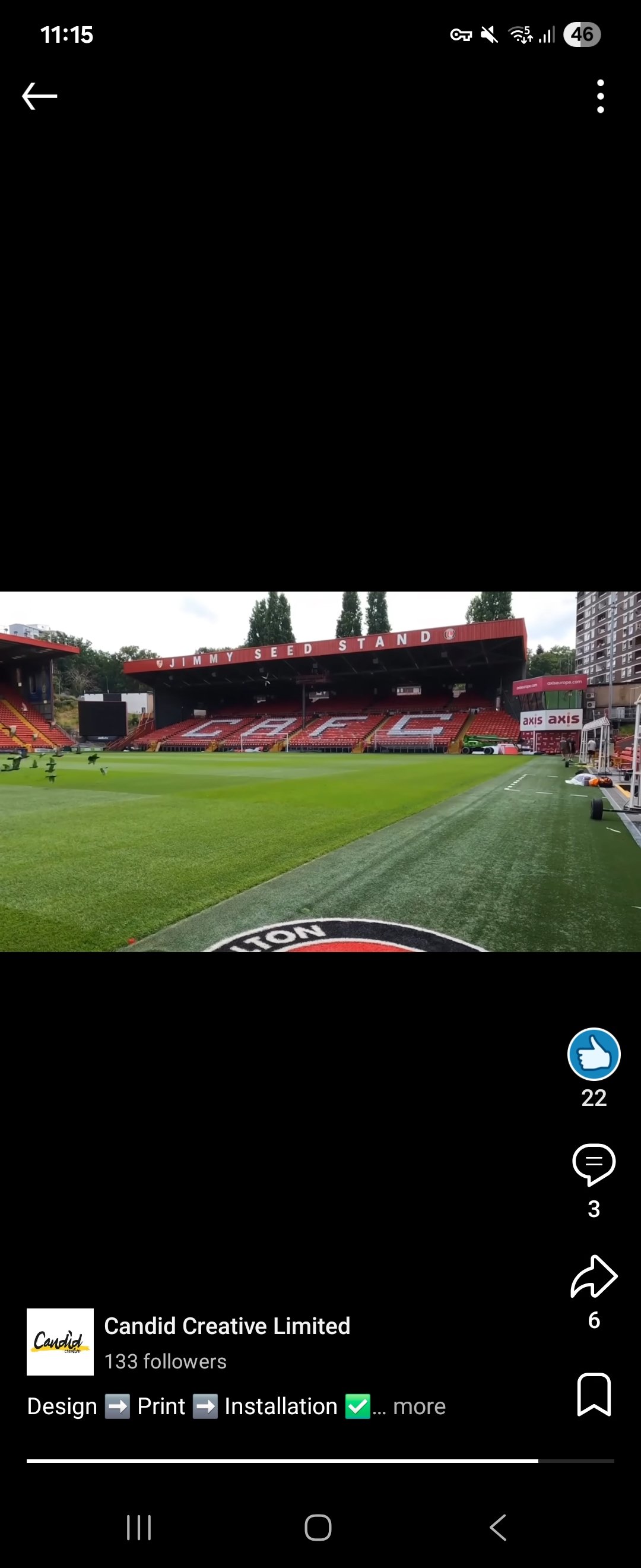
Jimmy Seed stand gets a refresh

Comments
-
Much better. If it's going to be around for a while, might as well look after it!0
-
I wonder if that's the new big screen installed too, or if that came afterwards.0
-
.0
-
Looks fantastic, like the letters being a lot bigger and clearer.6
-
Much better. The old stuck on sign looked cheap.4
-
Pigeons looking sharp7
-
They spelt South Stand wrong12
-
Think the company behind it is a Lifer’s.
Good job mate 👍29 -
Good. Well overdue.0
-
Sponsored links:
-
Great work on the refresh, looking good0
-
Best sign(ing) of the summer.6
-
Looks good but hopefully we shut a few toilets down and have fewer staff for refreshments have to keep up our vile status this season.1
-
Burn himWSS said:They spelt South Stand wrong10 -
It is so much better. The previous signage was never great in terms of style / spacing / size. Now it fits.Clever what technology allows.0
-
Don’t like that. I miss the two different shades of red.14
-
Just about to shit all over the new signage.oohaahmortimer said:Pigeons looking sharp2 -
Can I be the first to say that the scale of the lettering relative to the stand and relative to the other fascias (AC Stand / West Stand) is all wrong, as is the kerning.
BUT, beauty is in the eye of the beholder...
A massive improvement on what was there before so good work - having some pride in the state of the ground is a good sign.6 -
SporadicAddick said:Can I be the first to say that the scale of the lettering relative to the stand and relative to the other fascias (AC Stand / West Stand) is all wrong, as is the kerning.
BUT, beauty is in the eye of the beholder...
A massive improvement on what was there before so good work - having some pride in the state of the ground is a good sign.I see what you did there 😉😆4 -
Will need another refresh /deep clean after Millwall have been there3
-
Sponsored links:
-
Indeed. Fumigation more like!3G said:Will need another refresh /deep clean after Millwall have been there0 -
I wonder if they'll get round to removing the Bulldog energy drink thing in the AC or replacing the bit of missing perspex between the AC and family which means people underneath get soaked when it rains.0
-
Not sure the badges are adding much really2
-
Locks on Bog doors … ?0
-
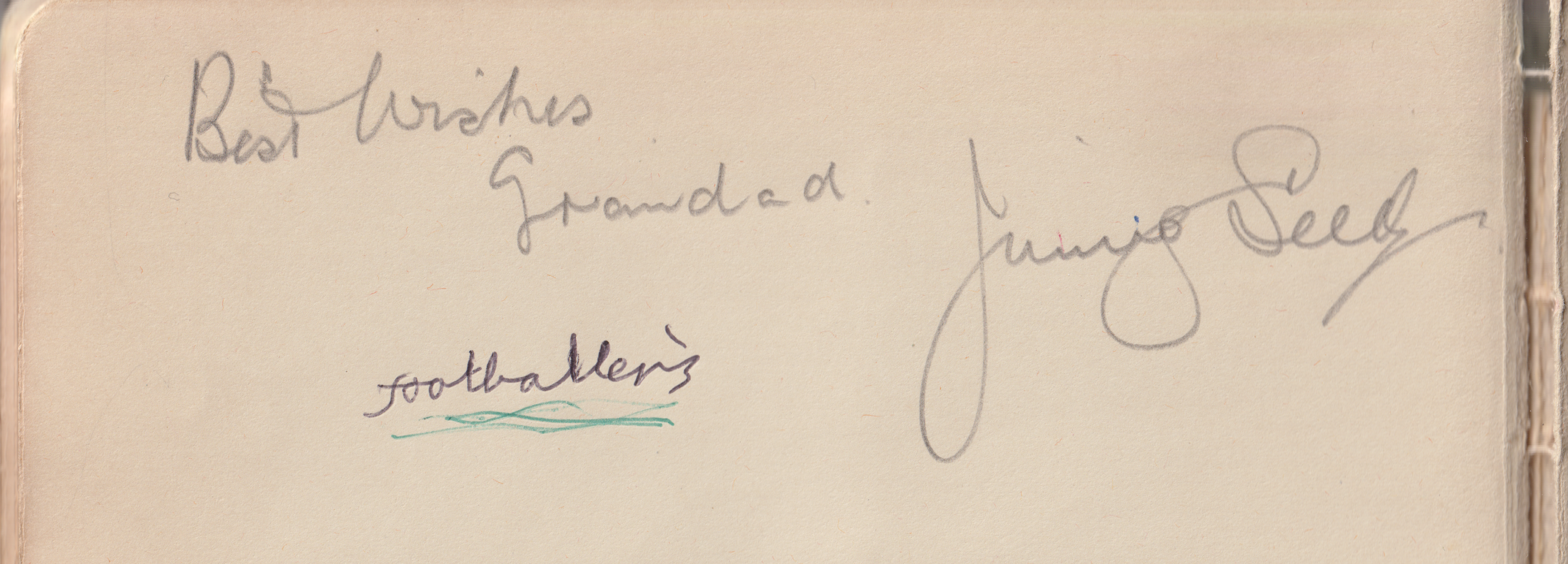
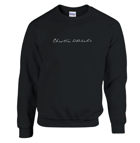
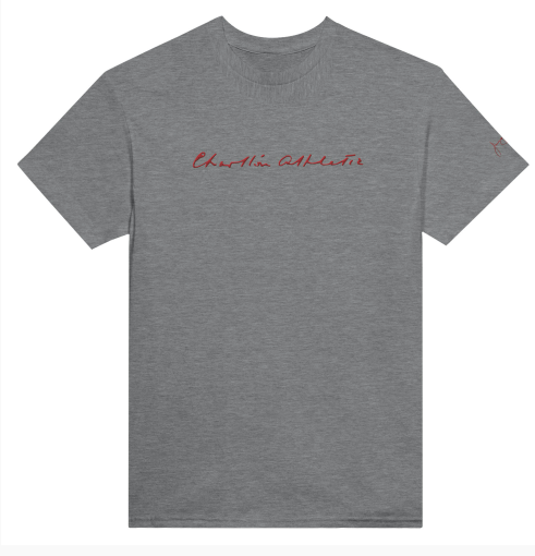
Unbelievable timing!
Charlton Athletic Supporters Trust are thrilled to launch a new line of merchandise – In homage to the Addicks’ Most Successful Manager Jimmy Seed!
The design, shows off the great mans handwritten ‘Charlton Athletic’ proudly on the chest focus, as well his very own Signature on the left sleeve. CAST extracted the fantastic penmanship from Seeds 1943 letter to Peter Croker – where he encouraged the player to sign for The Addicks! The Signature coming from an autograph book, which Seed most kindly signed for his very own grandson! The designs fantastically show the very handwriting, unchanged and 100% accurate, that brought so much success to SE7.
Various colours of T-Shirts and Plush Sweaters are available!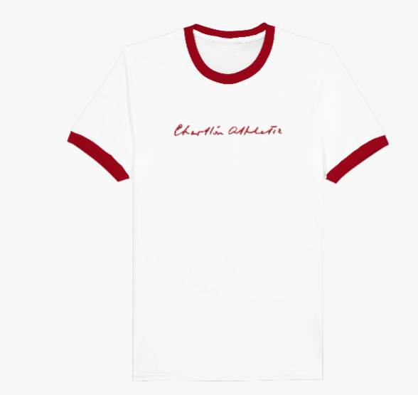
 7
7 -
A huge Thank You must also go to Jim Dutton ( @JamesSeed ), Jimmy Seeds’ Grandson, who helped find various examples of his grandfathers handwriting and signature- as well as some fabulous cartoons drawn by the great man. We would also like to say a big Thank You to colleagues at The Charlton Athletic Museum , who plucked out the fantastic letter mentioned above.


 22
22 -
Well done @JamesSeed 👍🏻👍🏻7
-
Lovely handwriting.2
-
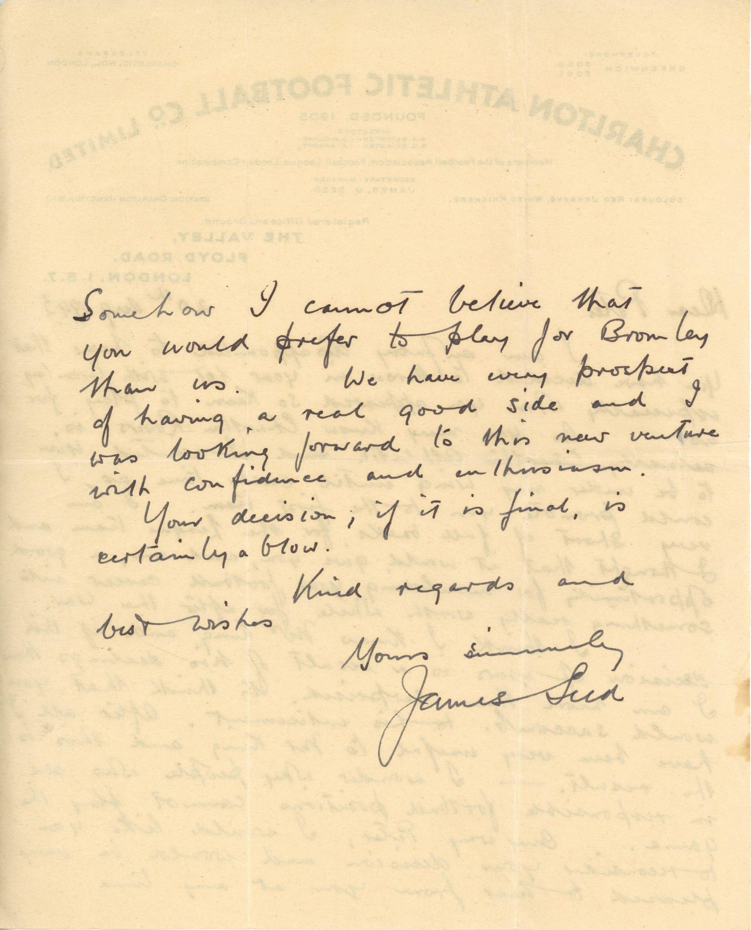
The letter sourced by the museum with JS writing the words "Charlton Athletic".
Surprisingly hard to find Seed using the full name used rather than just "Charlton" or "Charlton Ath".
The letter was sent to Peter Croker in 1943
15 -
Bromley were not too happy when Croker eventually signed for us but being from Bromley they were too well brought up and polite to say it directly.

10