Attention: Please take a moment to consider our terms and conditions before posting.
Reebok it is then (new 3rd shirt p51)
Comments
-
I’m a little bit disappointed with that….4
-
1 -
Yikes. That's a big 0/3 for Reebok for me. Guess they're not going to be my kind of kit supplier!
Also, I know that these launches are meant to be all cool and edgy and trying to convince people that football shirts are streetwear but the fact you never actually get to see the full kit in the launch is insane to me. I understand why they hid it with the away kit, because it somehow actually looks worse with the shorts, but it's bizarre that the shorts and socks just get described in a blurb but you don't get to see them - and then they tell you that it'll cost you an extra £40 to get them.6 -
This is a bit of a personal win for me. I don't like any of our new kits, so that's some £'s saved, unless they are heavily reduced near the end of the season, and the majority seem to like them so should sell well.
I'm just amazed that a company that is meant to specialise in design and clothing is doing worse jobs than concept art whacked up by a Charlton fan. I would have bought all 3 if @Nug was the one designing them.9 -
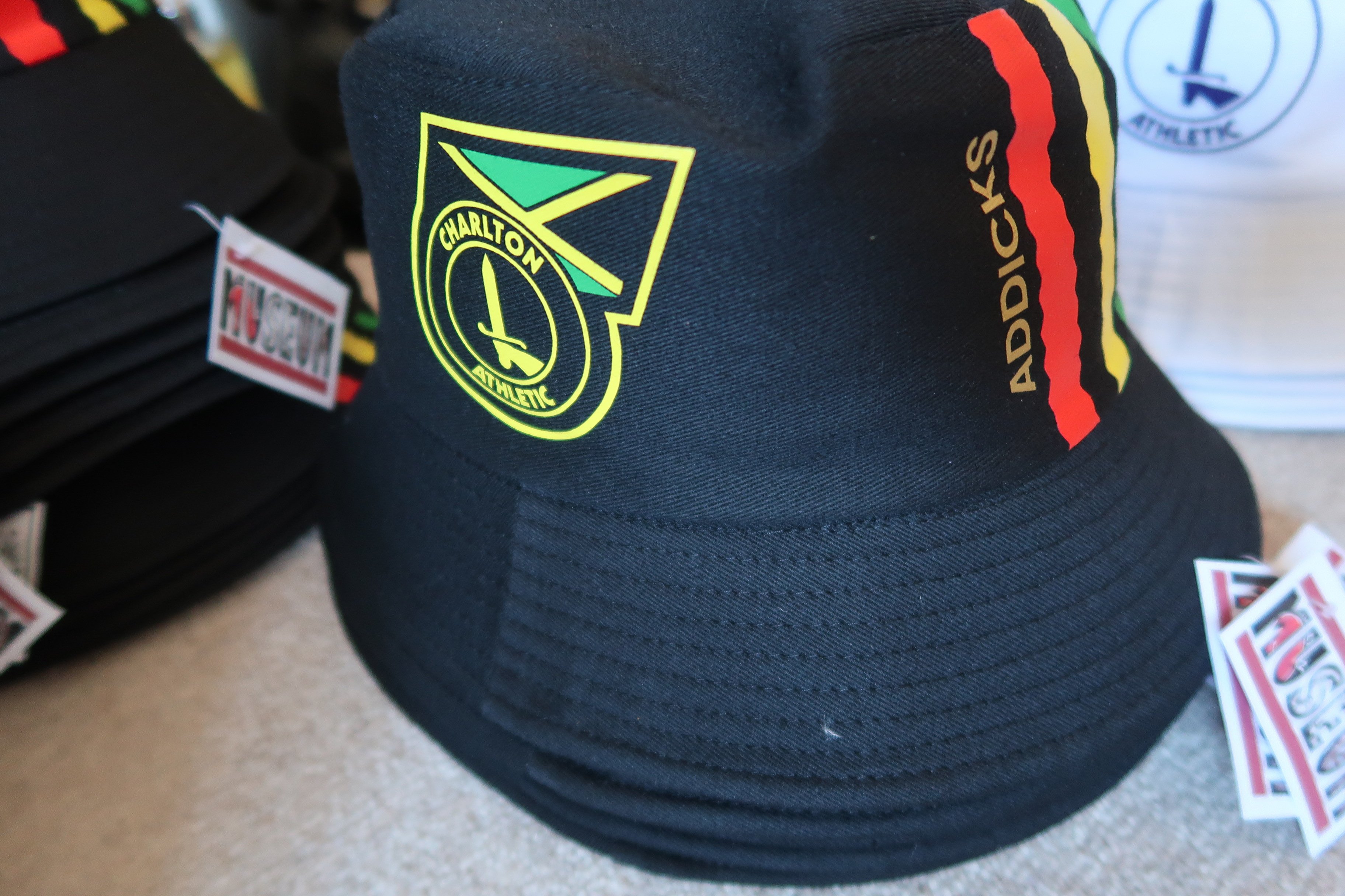
It is meant to be a nod to Jamacia? It doesn't say so in the OS blurb.
Nice enough. I think overall all three kits are too fussy but they're fine.
Kind of 6 or 7 out of 10 for me.0 -
Thats three poor kits IMO. Glad I got my retro now.1
-
Not a fan of the kit but god Elisha N'Dow is coolBraziliance said:3 -
anyone seen the shorts yet?
0 -
Sponsored links:
-
Those shorts don’t look very convenient to play inBraziliance said:12 -
That's naff glad it's only the 3rd. They've tried to do too much with it0
-
I think that's really nice. Lots to like in the 3 kits, although I agree RSK is way too big across the board, I cant remember the specs for sponsors logos but these must exceed the minimum requirements. Thankfully it's a simple enough logo, could be worse I guess.
I think these are an upgrade on what we've had in the past, particularly 2nd and 3rd kits, definitely more aimed at the "yoof" crowd which isn't a bad thing.7 -
I’m not sure the pops of yellow and green are in the right places or flow particularly well. I don’t mind the stripes down the sides, but the bit around the neck doesn’t really work for me and looks a bit random. I reckon it would’ve looked better if the colours were used in stripes across the front of the shoulders, a bit like the early '90s England cricket World Cup shirt.0
-
Why is it so shiny? My other issue with new football shirts are they are all so thin and naff. Hummel, Castore & Reebok all have the same problem. Nike & Adidas feel much nicer, especially the 'pro' versions of the shirts.3
-
Design wise Reebok have done well - not great, but well.
Quality wise, not so good IMHO
Hopefully there will be a better consultation on the next batch
1 -
It’s stupid to compare them. One was following a brief set by the club, the other did what they wanted.Braziliance said:This is a bit of a personal win for me. I don't like any of our new kits, so that's some £'s saved, unless they are heavily reduced near the end of the season, and the majority seem to like them so should sell well.
I'm just amazed that a company that is meant to specialise in design and clothing is doing worse jobs than concept art whacked up by a Charlton fan. I would have bought all 3 if @Nug was the one designing them.The Reebok have made three designs that follow the clubs design visions which have also been well regarded by lots of people.2 -
Yet another abomination from the the House of Geez.1
-
Regarding the RSK logo, from what I can see on the FA website, there is no minimum size it must be but the maximum is 250cm2. I would imagine we are at that and because it's only a 3 character logo it looks massive. A bit of discretion should have been used I think. Even at 75% of that size it would be very clear and legible.3
-
Thats a shocker, awful design1
-
Sponsored links:
-
I’d love to know what the clubs “design visions” are.AberystwythAddick said:
It’s stupid to compare them. One was following a brief set by the club, the other did what they wanted.Braziliance said:This is a bit of a personal win for me. I don't like any of our new kits, so that's some £'s saved, unless they are heavily reduced near the end of the season, and the majority seem to like them so should sell well.
I'm just amazed that a company that is meant to specialise in design and clothing is doing worse jobs than concept art whacked up by a Charlton fan. I would have bought all 3 if @Nug was the one designing them.The Reebok have made three designs that follow the clubs design visions which have also been well regarded by lots of people.I’m not sure the club has an in house design team sitting on bean bags wearing Birkenstocks and “ideating”.
far more likely that Reebok made design suggestions that the club approved.0 -
In general I think the designs are pretty good, no real complaints
Quality isn't great though0 -
Love it, I’ll be getting that along with the home.0
-
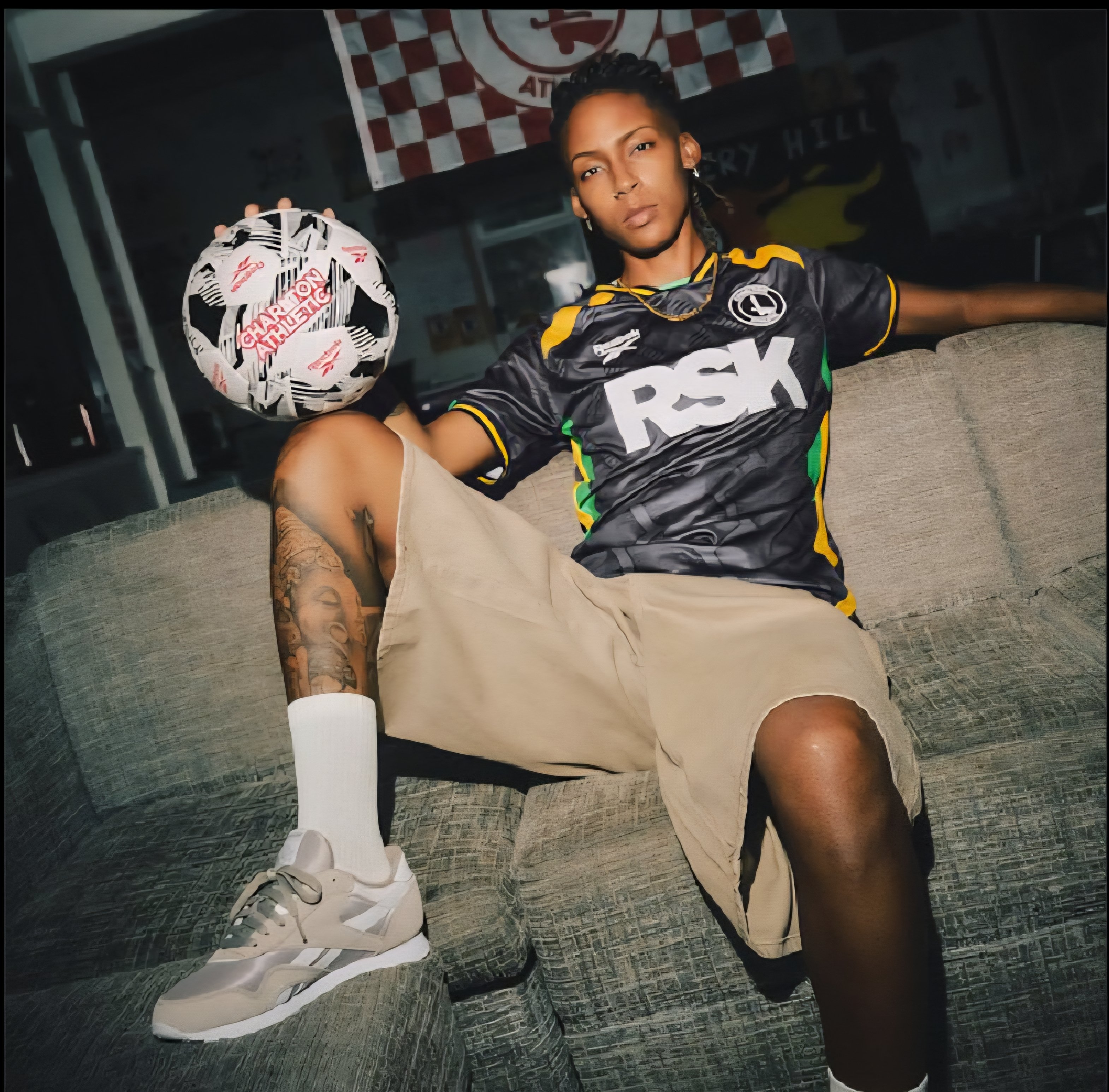
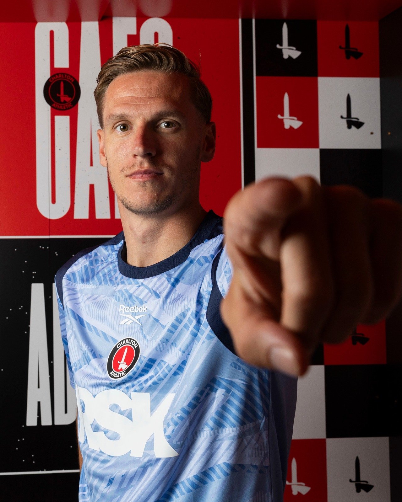
Introducing our 2025/26 third goalkeeper shirt 🧤
5 -
Would be a bit of a mess if they tried to create a shirt that includes all the nations of the world!ShootersHillGuru said:I quite like it but a serious question. Why pick what is undoubtedly a national shirt (Jamaica) and what made us choose Jamaica ? I know we’ve got a few Jamaicans in the squad now and the connection with a Jamaican football club but it still seems to me to be strange to be so overtly leaning towards one nationality.
South east London has a massive Jamaican community and we have a fair few Jamaican national team players in our squad. And Larry’s sells rum punch in Crossbars.
1 -
All 3 goalkeeper shirts are great5
-
Every club give the suppliers a brief of what is desired. The supplier then comes back. You don’t need a design team to inform a supplier what you wantSporadicAddick said:
I’d love to know what the clubs “design visions” are.AberystwythAddick said:
It’s stupid to compare them. One was following a brief set by the club, the other did what they wanted.Braziliance said:This is a bit of a personal win for me. I don't like any of our new kits, so that's some £'s saved, unless they are heavily reduced near the end of the season, and the majority seem to like them so should sell well.
I'm just amazed that a company that is meant to specialise in design and clothing is doing worse jobs than concept art whacked up by a Charlton fan. I would have bought all 3 if @Nug was the one designing them.The Reebok have made three designs that follow the clubs design visions which have also been well regarded by lots of people.I’m not sure the club has an in house design team sitting on bean bags wearing Birkenstocks and “ideating”.
far more likely that Reebok made design suggestions that the club approved.1 -
The Jamaican flag is the only one without the colours red, white or blue so given the colours of our home and away kits it does make a modicum of sense (plus we have four Jamaican internationals).se9addick said:
Would be a bit of a mess if they tried to create a shirt that includes all the nations of the world!ShootersHillGuru said:I quite like it but a serious question. Why pick what is undoubtedly a national shirt (Jamaica) and what made us choose Jamaica ? I know we’ve got a few Jamaicans in the squad now and the connection with a Jamaican football club but it still seems to me to be strange to be so overtly leaning towards one nationality.
South east London has a massive Jamaican community and we have a fair few Jamaican national team players in our squad. And Larry’s sells rum punch in Crossbars.0 -
The perfect addition to the new 3rd kit5