Attention: Please take a moment to consider our terms and conditions before posting.
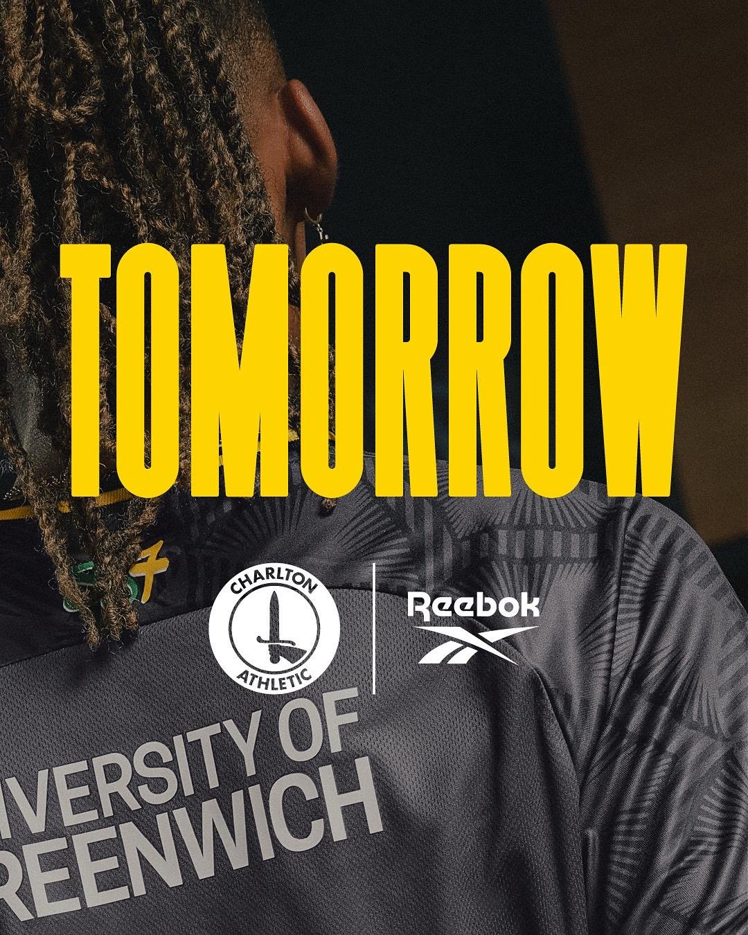
Reebok it is then (new 3rd shirt p51)
Comments
-
Seems I may not be buying a Jamaica shirt after all then.0
-
Quite excited to see this one

4 -
Fuck, if the photoshoot isn't TC, Dixon, Anderson and Bell on an ice rink I don't want it
18 -
That's exactly how you make a shirt collectable by more people than just your existing fan base.7
-
Looks very promising to me, love the Jamaican color scheme.
On a side note: For those who have bought the new Reebok shirts, how do they fit? I am 6'3 280 pounds and don't won't it too tight haha so assume would need to get at least a 4xl? Maybe 5xL?
Cheers.1 -
Really excited by this one. Took a long time for the fish to swim out of the ocean, grow legs and start walking, but we got there in the end

It’s the shirt I’ll be buying.4 -
Can’t wait to see and get this.0
-
Personally think they are coming up a bit smaller than last season if that helps.Krusty said:Looks very promising to me, love the Jamaican color scheme.
On a side note: For those who have bought the new Reebok shirts, how do they fit? I am 6'3 280 pounds and don't won't it too tight haha so assume would need to get at least a 4xl? Maybe 5xL?
Cheers.0 -
Sponsored links:
-
Fun fact. Jamaica is the only country that doesn’t have red, white or blue on its flagRed_Chester said:Our third kit is actually the Jamaican colours 🤣2 -
I wouldn’t describe maroon as red (Sri Lanka ) but it is A redMrOneLung said:
Fun fact. Jamaica is the only country that doesn’t have red, white or blue on its flagRed_Chester said:Our third kit is actually the Jamaican colours 🤣0 -
I’m never gonna financially recover from this.7
-
This one is really smart and was the one that stood out when we saw the designs back in Feb4
-
I'm really hoping the sponsors and badge/Reebok logo match, would look great if the whole thing is black with yellow and green, will look naff if the sponsor is white and our badge is full colour tbh1
-
sam3110 said:Fuck, if the photoshoot isn't TC, Dixon, Anderson and Bell on an ice rink I don't want it
Im hoping its Carey, Doherty and Godden dressed up as 10cc doing a rendition of Dreadlock Holiday.
2 -
So would this originally have been the away kit?1
-
cafcdave123 said:
I wouldn’t describe maroon as red (Sri Lanka ) but it is A redMrOneLung said:
Fun fact. Jamaica is the only country that doesn’t have red, white or blue on its flagRed_Chester said:Our third kit is actually the Jamaican colours 🤣
0 -
If the design is half decent I can see this doing the rounds on SM and doing record numbers for a shirt of ours.sam3110 said:I'm really hoping the sponsors and badge/Reebok logo match, would look great if the whole thing is black with yellow and green, will look naff if the sponsor is white and our badge is full colour tbh0 -
shine166 said:
If the design is half decent I can see this doing the rounds on SM and doing record numbers for a shirt of ours.sam3110 said:I'm really hoping the sponsors and badge/Reebok logo match, would look great if the whole thing is black with yellow and green, will look naff if the sponsor is white and our badge is full colour tbh
We sold good numbers of our Redbus black top, apparantly this colour is a popular seller elsewhere.
0 -
Sponsored links:
-
2 -
First time I can remember in a long time, I’ve bought home and away shirt, also bought the goalies shirt (first time ever) if this one’s good, it’s going to rinse me out!stoneroses19 said:0 -
Oof! Will everyone who wants one get one? Cos I want one.0
-
Can't stand that graffiti style SE7 on the back of the neck, looks tacky as fuck and awful on all the merch in the official store.
Looks like something you see on Redbubble.
Colour scheme looks good though, I hope the sponsors and badge blend in with the kit7 -
What about a graffiti hawaiian shirt?0
-
Yeah it definitely looks like some kind of stock 'graff' style font that they use. With that and the SS style text we use they are strange choices lol.Braziliance said:Can't stand that graffiti style SE7 on the back of the neck, looks tacky as fuck and awful on all the merch in the official store.
Looks like something you see on Redbubble.
Colour scheme looks good though, I hope the sponsors and badge blend in with the kit0 -
shine166 said:
Yeah it definitely looks like some kind of stock 'graff' style font that they use. With that and the SS style text we use they are strange choices lol.Braziliance said:Can't stand that graffiti style SE7 on the back of the neck, looks tacky as fuck and awful on all the merch in the official store.
Looks like something you see on Redbubble.
Colour scheme looks good though, I hope the sponsors and badge blend in with the kit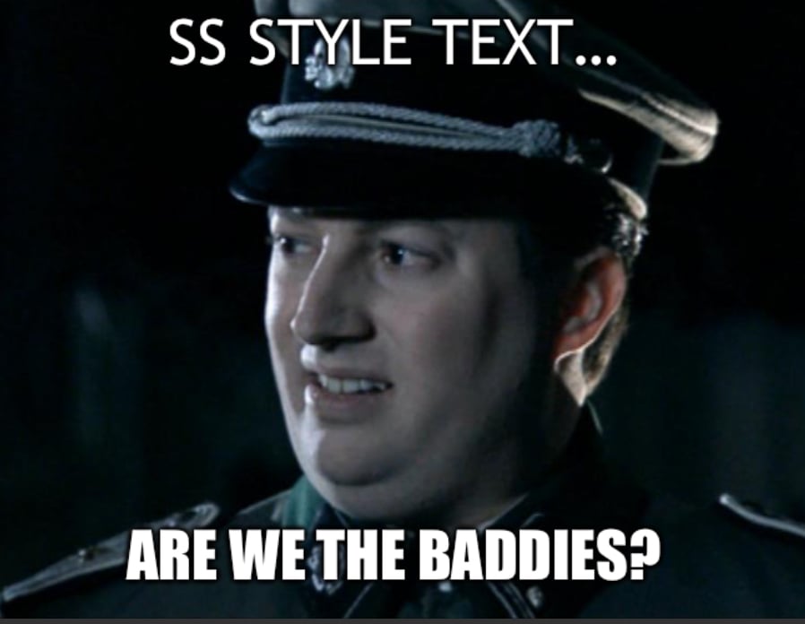
9 -
The other text I think is meant to mimic the font used in the Che Hales flag but the white with black edges does make it look a bit SS likeshine166 said:
Yeah it definitely looks like some kind of stock 'graff' style font that they use. With that and the SS style text we use they are strange choices lol.Braziliance said:Can't stand that graffiti style SE7 on the back of the neck, looks tacky as fuck and awful on all the merch in the official store.
Looks like something you see on Redbubble.
Colour scheme looks good though, I hope the sponsors and badge blend in with the kit0 -
Colour RSK normally use is green isn't it?Braziliance said:Can't stand that graffiti style SE7 on the back of the neck, looks tacky as fuck and awful on all the merch in the official store.
Looks like something you see on Redbubble.
Colour scheme looks good though, I hope the sponsors and badge blend in with the kit0 -
Yes but very different shadeTalal said:
Colour RSK normally use is green isn't it?Braziliance said:Can't stand that graffiti style SE7 on the back of the neck, looks tacky as fuck and awful on all the merch in the official store.
Looks like something you see on Redbubble.
Colour scheme looks good though, I hope the sponsors and badge blend in with the kit
0